Total Post: 2,279

Galano Grotesque Font
Free typefaces help reduce costs for your design projects. They are a budget-friendly option, especially for small businesses, independent designers, or students.

Wide Variety: There are numerous free font resources available on the internet. By utilizing these sources, you can choose from a wide variety of fonts and select the one that best fits your project.

Boost Creativity: Free typefaces enable you to create creative projects even with a limited budget. There are many free fonts available in different styles and designs, allowing you to choose the most suitable one for your project and enhance your creativity.

Trial and Rapid Iteration: Using free typefaces allows you to quickly iterate and experiment with different fonts in your design projects. This helps you find the font that best meets the needs of your project and improves your design.

Community Contribution: Many free fonts are created and shared by independent designers or communities. This contributes to the sharing nature of the design community and increases accessibility to knowledge and resources in the design world.

Easy Access: Free fonts are often easily accessible on the internet. You can find and start using the desired font with just a few clicks online.

However, there are some points to consider when using free typefaces. For example, it is important to carefully review the font's license terms and determine usage permissions. Additionally, if your project requires a professional and corporate image, opting for paid and licensed fonts may be more appropriate.

The importance of font selection in graphic design works is significant because choosing the right font can determine the impact and communication power of the design. Here are some points highlighting the importance of font in graphic design:


FONT NAME:

Galano Grotesque Font Free Download
DESCRIPTION:

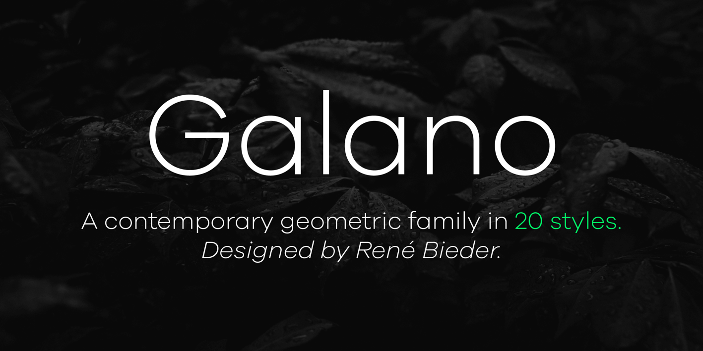
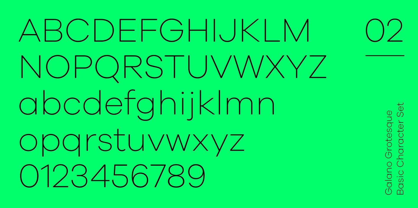
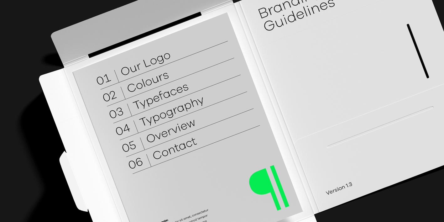
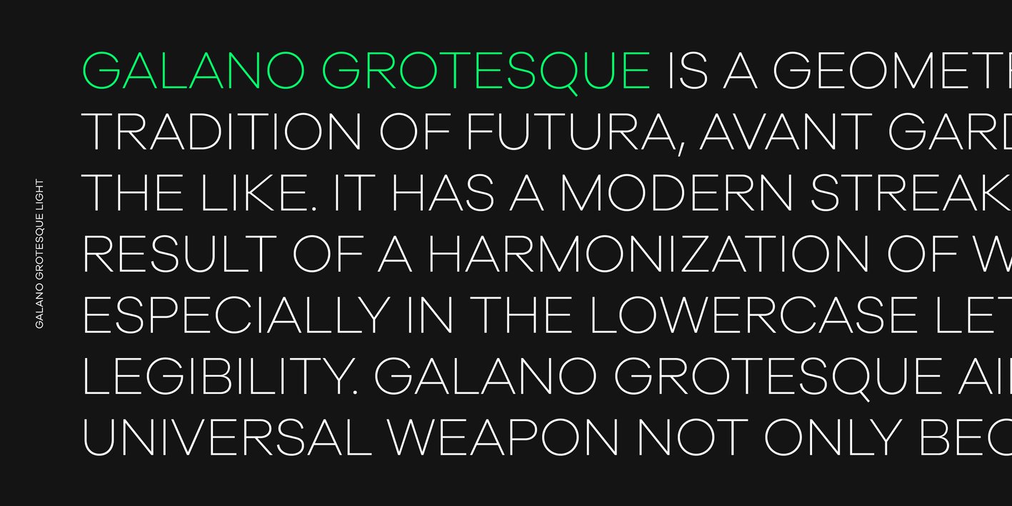
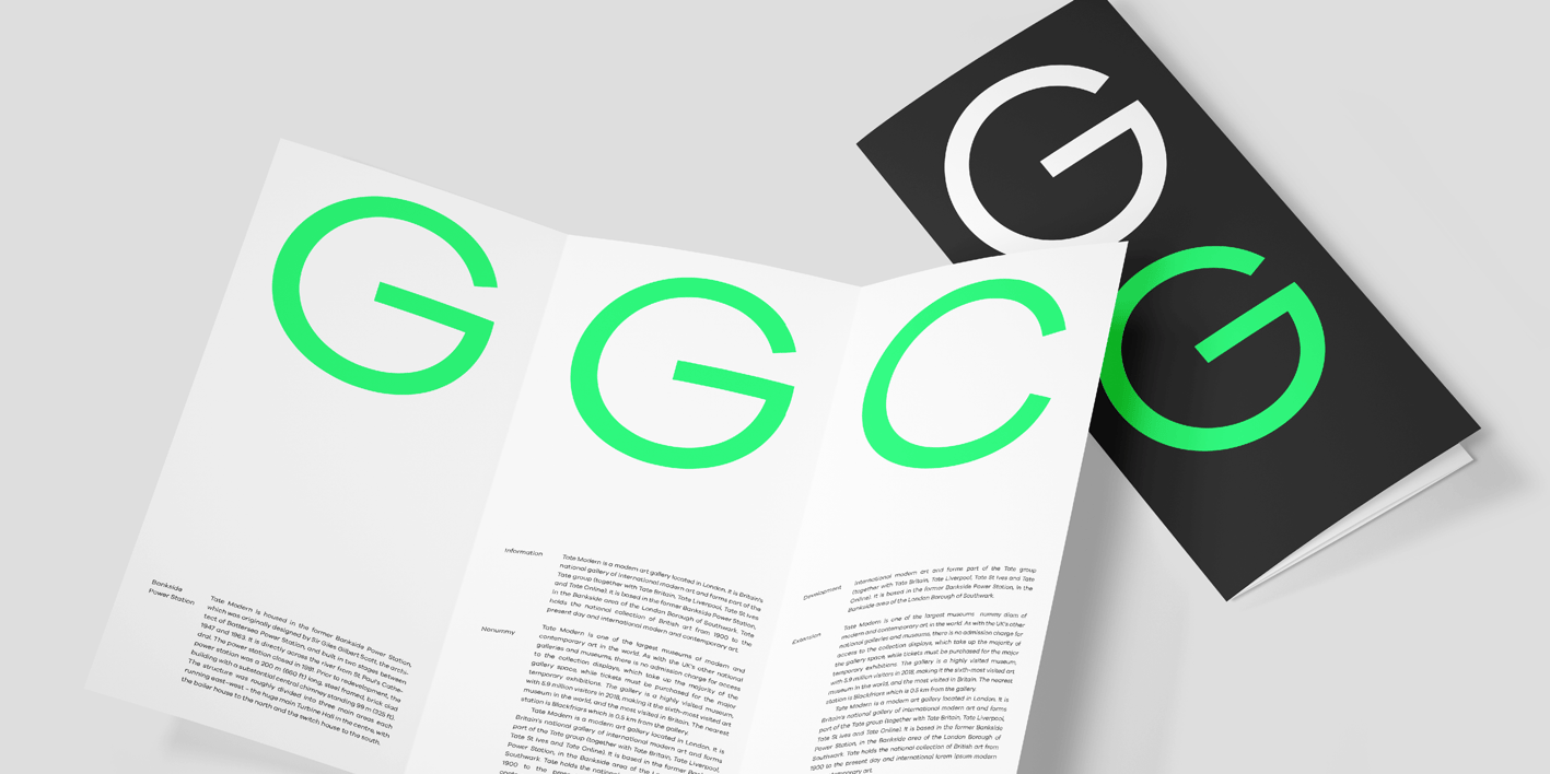
Galano Grotesque is a geometric sans in the tradition of Futura, Avant Garde, Avenir and the like. It has a modern streak which is the result of a harmonization of width and height especially in the lowercase letters to support legibility. Galano Grotesque aims to be a universal weapon not only because it works great in headlines, short and long copies but also because of its subtle neutrality. It comes in 10 different weights with matching italics and is equipped with a set of powerful opentype features including alternative glyphs, fraction, arrows, ligatures and many more. An extended character set, supporting Central, Western and Eastern European languages, rounds up the family. During the design process of the alternative glyph shapes of Galano Grotesque, the interest of creating a standalone version emerged rapidly. This was the birth of Galano Grotesque Alt. Not only because of the legible and unique character created by the alternatives, but also because this could be the small copy embracing stylistic companion to Galano Grotesque. In addition to the alternative glyphs, the height of descender and ascender was increased, supporting structure and rhythm. When finishing Galano Grotesque Alt, it turned out to not only work great in small and long copies but also to be a great performer in headlines and short copies. I'm proud to introduce: Galano Grotesque and Galano Grotesque Alt.

VIEWS: 40