Total Post: 2,279

Franca Font


Free typefaces help reduce costs for your design projects. They are a budget-friendly option, especially for small businesses, independent designers, or students.

Wide Variety: There are numerous free font resources available on the internet. By utilizing these sources, you can choose from a wide variety of fonts and select the one that best fits your project.

Boost Creativity: Free typefaces enable you to create creative projects even with a limited budget. There are many free fonts available in different styles and designs, allowing you to choose the most suitable one for your project and enhance your creativity.

Trial and Rapid Iteration: Using free typefaces allows you to quickly iterate and experiment with different fonts in your design projects. This helps you find the font that best meets the needs of your project and improves your design.

Community Contribution: Many free fonts are created and shared by independent designers or communities. This contributes to the sharing nature of the design community and increases accessibility to knowledge and resources in the design world.

Easy Access: Free fonts are often easily accessible on the internet. You can find and start using the desired font with just a few clicks online.

However, there are some points to consider when using free typefaces. For example, it is important to carefully review the font's license terms and determine usage permissions. Additionally, if your project requires a professional and corporate image, opting for paid and licensed fonts may be more appropriate.

The importance of font selection in graphic design works is significant because choosing the right font can determine the impact and communication power of the design. Here are some points highlighting the importance of font in graphic design:


License: Demo for Personal Use
DMCA Contact Form: [email protected]

FONT NAME:

Franca Font Free Download

DESCRIPTION:

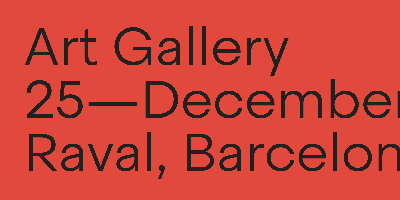
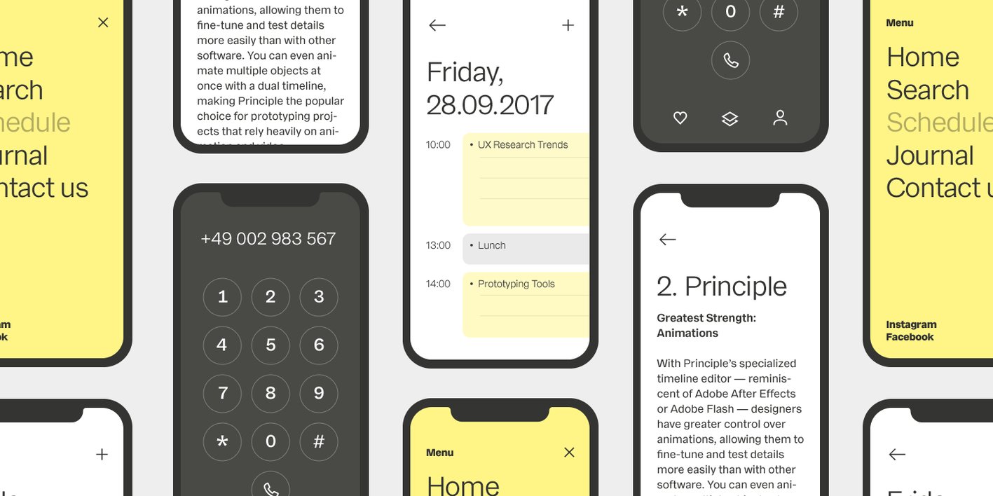
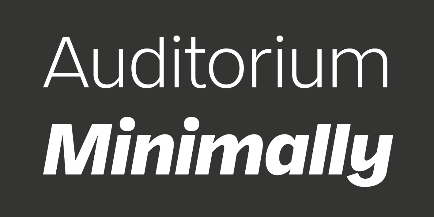
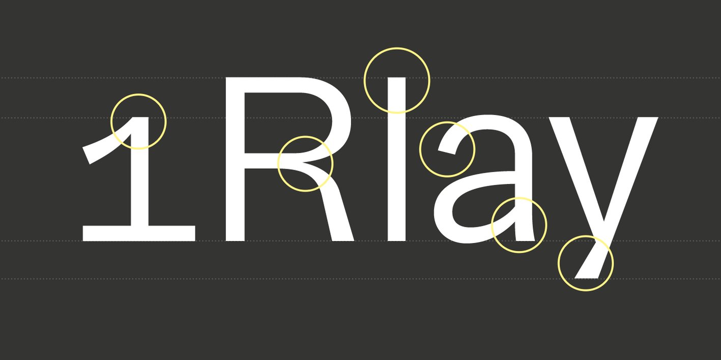
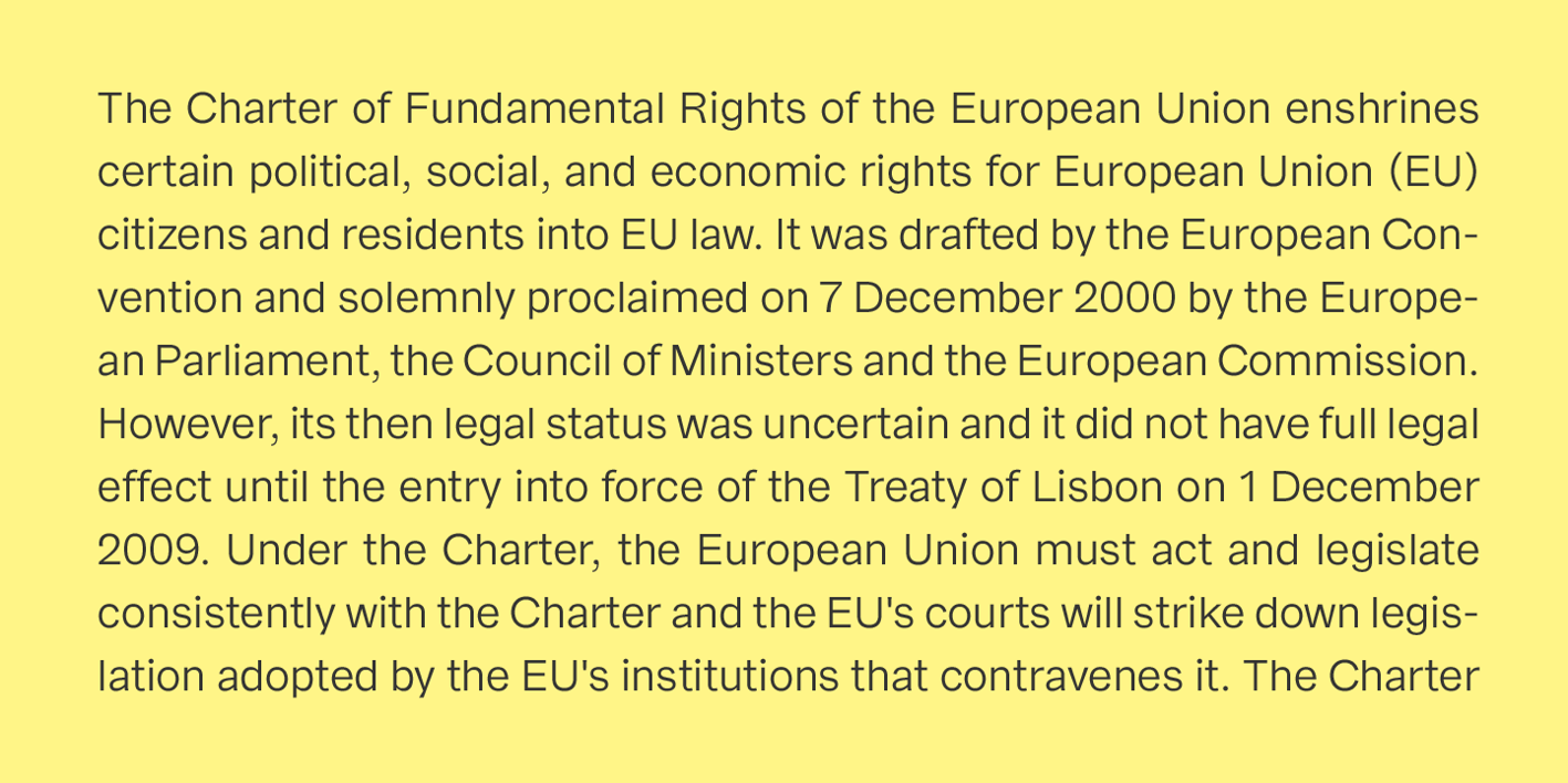
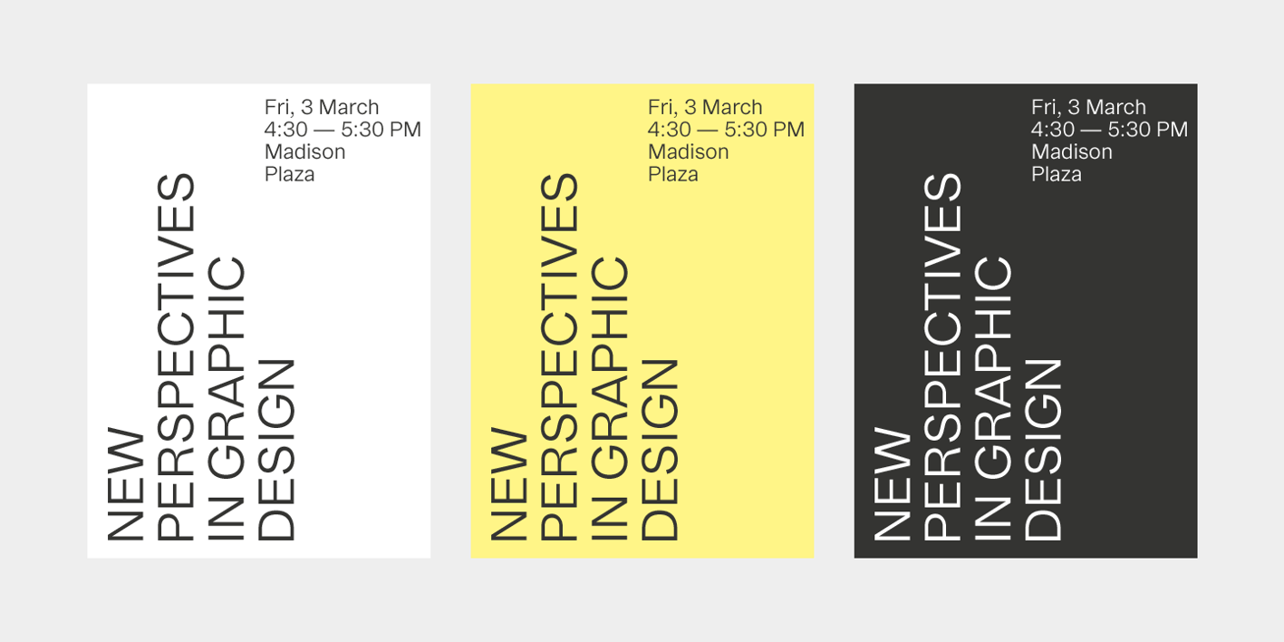
Franca is a neo-grotesk family in nine weights plus matching italics. The inspiration for the design came through the constant interest in new interpretations of the classic grotesk model and a study of "neutral“ typefaces like Helvetica, Univers or Normal Grotesk. During the studies, additional attention was given to the American representatives of the genre, resulting in the initial impetus for a reinterpretation, combining both paths into one contemporary design. This is reflected in the name, blending together the names of the most popular typefaces of each genres, (Fran)klin and Helveti(ca). Due to its large x-height and plain design, the family is perfectly suited for all kinds of text. Its mid-weights are optimized for usage in long paragraphs, while the bolder weights, due to a short descender and ascender, create a compact and confident look in headlines or short copy. In order to create strong and dynamic italics, the oblique glyph shapes come with a faint calligraphic hint, defined by a higher stroke contrast and a steeper connection between stems and arcs in, for example, h n m and u. This is followed by different standard shapes for a and y, supporting the dynamic movement of the lowercase in general. A wide range of OpenType features such as ligatures, old style figures, fractions, case-sensitive shapes and many more, are available for professional and contemporary typesetting. This is completed with eleven alternative glyph sets, enabling a quick customization of the typeface. The family supports up to 92 languages and comes with 500+ glyphs per font.
VIEWS: 33