Total Post: 2,279

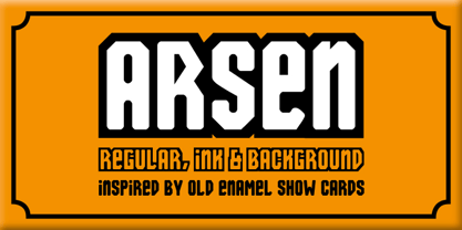
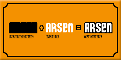
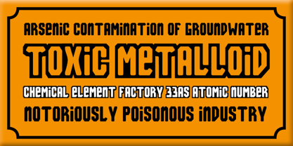
Arsen Font


Free typefaces help reduce costs for your design projects. They are a budget-friendly option, especially for small businesses, independent designers, or students.

Wide Variety: There are numerous free font resources available on the internet. By utilizing these sources, you can choose from a wide variety of fonts and select the one that best fits your project.

Boost Creativity: Free typefaces enable you to create creative projects even with a limited budget. There are many free fonts available in different styles and designs, allowing you to choose the most suitable one for your project and enhance your creativity.

Trial and Rapid Iteration: Using free typefaces allows you to quickly iterate and experiment with different fonts in your design projects. This helps you find the font that best meets the needs of your project and improves your design.

Community Contribution: Many free fonts are created and shared by independent designers or communities. This contributes to the sharing nature of the design community and increases accessibility to knowledge and resources in the design world.

Easy Access: Free fonts are often easily accessible on the internet. You can find and start using the desired font with just a few clicks online.

However, there are some points to consider when using free typefaces. For example, it is important to carefully review the font's license terms and determine usage permissions. Additionally, if your project requires a professional and corporate image, opting for paid and licensed fonts may be more appropriate.

The importance of font selection in graphic design works is significant because choosing the right font can determine the impact and communication power of the design. Here are some points highlighting the importance of font in graphic design:


License: Demo for Personal Use
DMCA Contact Form: [email protected]

FONT NAME:

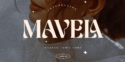
Arsen Font Free Download

DESCRIPTION:

Volcano Type is a independent font foundry based in Karlsruhe, Germany. The first course: a fast food youthfulness that was served for the first time in 1996. An earthy dish, created by chance, with thirteen organic fonts. Quickly whisked up and devoured. It rarely took more than a few days from sketch to use/digestion by the project. Uncouth forms, erupted from the bowels of the earth. Shattered letters, branded, stressed, humiliated. In order to produce arrogant fonts, far too expressive to last on a page of copy text. Quite indisputably from nature. Still roughly hewn. Raw. Imperfect. The second course formed a strong contrast: tight concept, linear work, disciplined preparation. In most cases the font was formed by a matrix. Digital cool, sober, reduced. Plenty of free scope, like chess: the board is always the same, the moves always different. Classic openings are followed by unfamiliar variants. Competitive games. Finely nuanced movements. Carefully thought out, one masterminded brainchild after another. Dessert: mathematical severity is rounded off and smoothed down. Fonts between digital and analogue. Straightened rivers - the surfaces of our times.
VIEWS: 25