Total Post: 10,668
-OC Rey Font
-OC Rey Font
-OC Rey Font, Free typefaces help reduce costs for your design projects. They are a budget-friendly option, especially for small businesses, independent designers, or students.
Wide Variety: There are numerous free font resources available on the internet. By utilizing these sources, you can choose from a wide variety of fonts and select the one that best fits your project.
Boost Creativity: Free typefaces enable you to create creative projects even with a limited budget. There are many free fonts available in different styles and designs, allowing you to choose the most suitable one for your project and enhance your creativity.
Trial and Rapid Iteration: Using free typefaces allows you to quickly iterate and experiment with different fonts in your design projects. This helps you find the font that best meets the needs of your project and improves your design.
Community Contribution: Many free fonts are created and shared by independent designers or communities. This contributes to the sharing nature of the design community and increases accessibility to knowledge and resources in the design world.
Easy Access: Free fonts are often easily accessible on the internet. You can find and start using the desired font with just a few clicks online.
However, there are some points to consider when using free typefaces. For example, it is important to carefully review the font's license terms and determine usage permissions. Additionally, if your project requires a professional and corporate image, opting for paid and licensed fonts may be more appropriate.
The importance of font selection in graphic design works is significant because choosing the right font can determine the impact and communication power of the design. Here are some points highlighting the importance of font in graphic design:
-OC Rey Font
-OC Rey Font
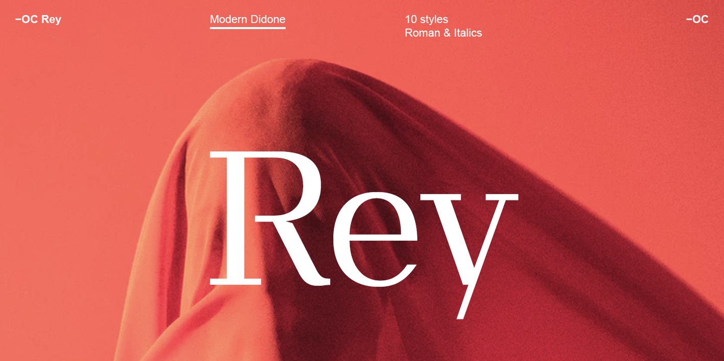
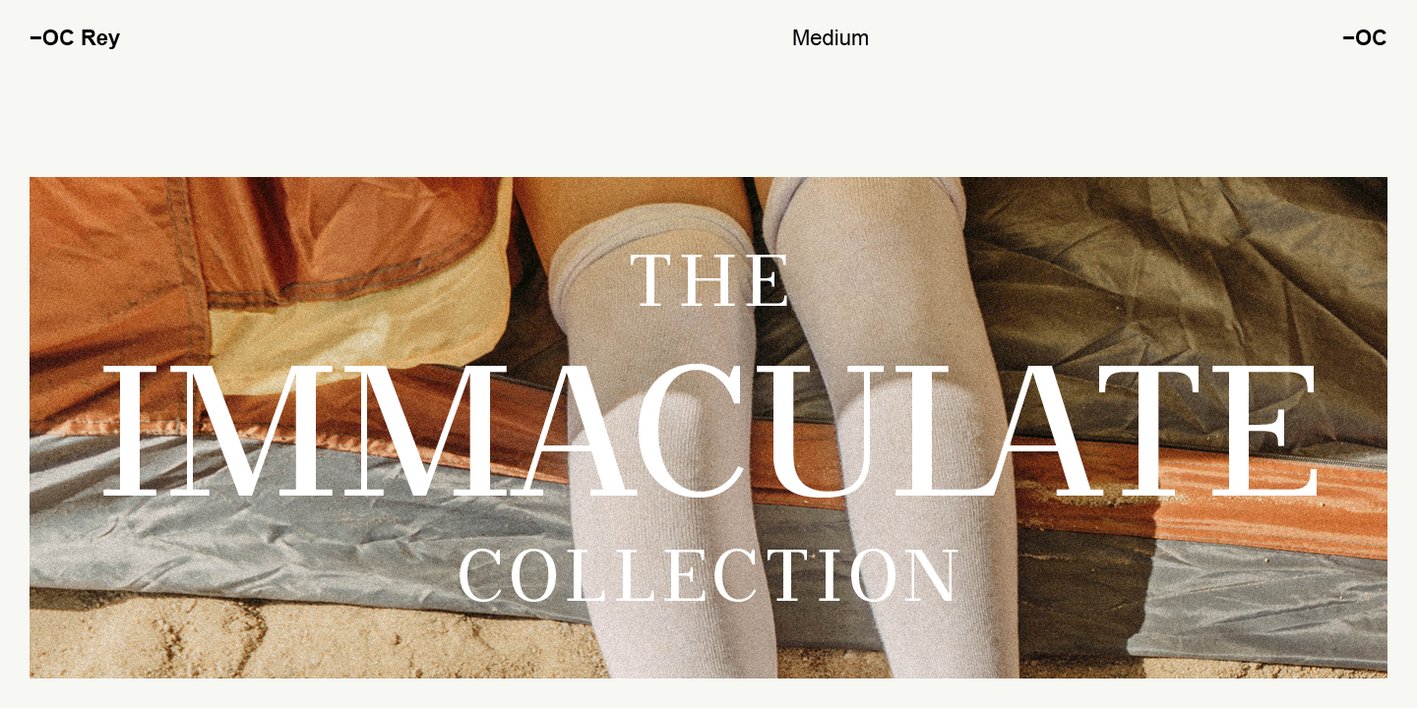
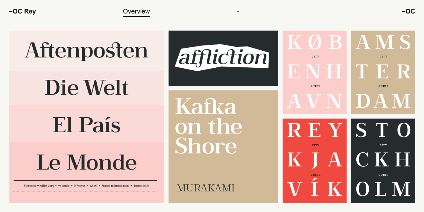
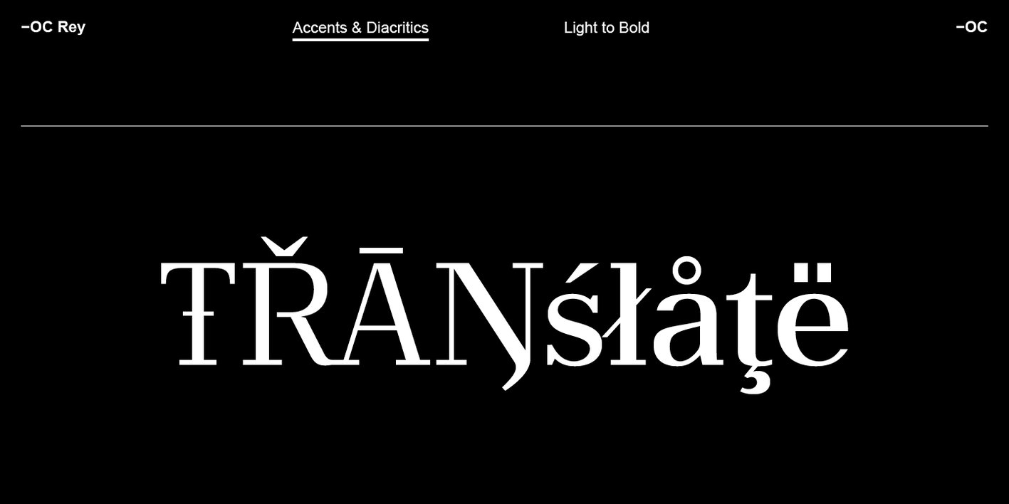
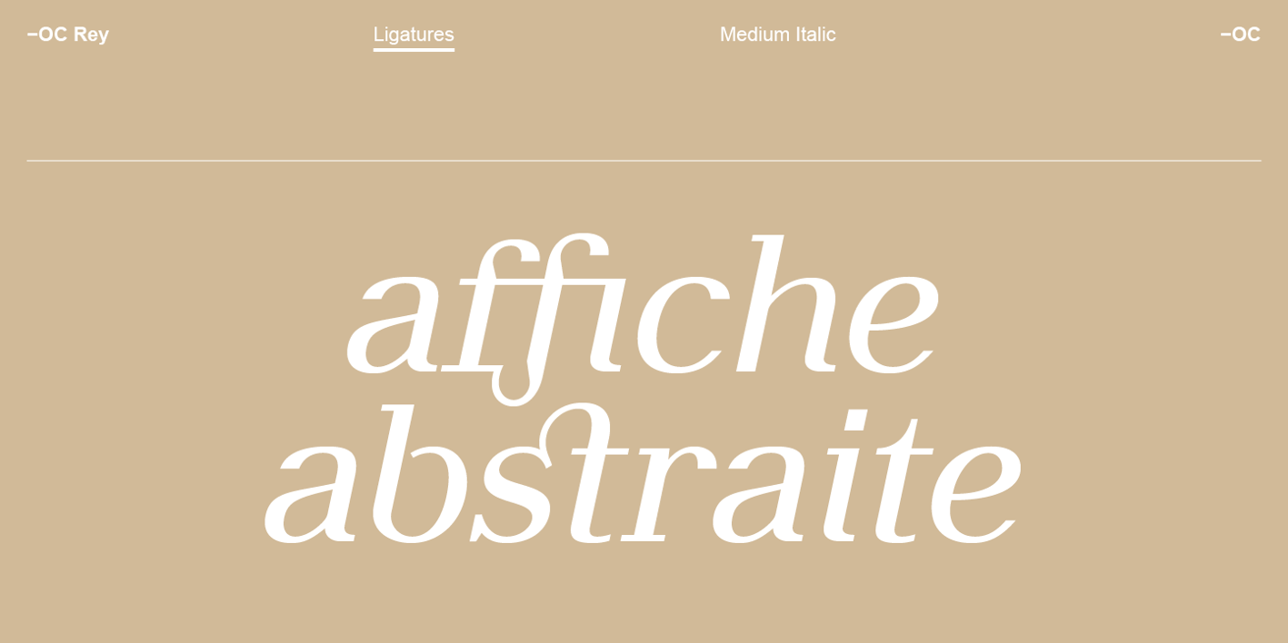
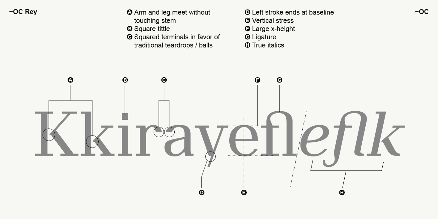
Available in ten styles -OC Rey is a modern Didone font featuring true italics and signature ligatures that can take designs to another level. Classical in character it is drawn with thick vertical stems and fine horizontal lines, a contrast which starts gradually at the lightest weight, building abruptly to the thick stems of bold. The forms are even in proportion and structure with a vertical stress giving a proud, upright stance and an air of distinction. The beauty of the high-end uppercase excels in elegant headlines perfect for the arena of art and fashion, while the high x-height, large eyes and apertures and distinctive open counters make it perfect for readable copy. With a traditional appearance and a refined elegance, itís reverent but also breaks from convention with distinguished characteristics that suggest heritage in a modern context. Traditionally round features are replaced with sharp corners, noticeably in the square tittles and the absence of heavy soft ball terminals giving it a unique presence. The weight of the unbracketed serifs is deliberately less extreme than some Didone hairlines, meaning itís beauty doesnít disintegrate when small or reversed, making for excellent versatility. -OC Rey is designed with extensive language support and with multiple open type features.