Total Post: 3,344

Epoque Seria Font

Epoque Seria Font Free Download


Epoque Seria Font, Free typefaces help reduce costs for your design projects. They are a budget-friendly option, especially for small businesses, independent designers, or students.

Wide Variety: There are numerous free font resources available on the internet. By utilizing these sources, you can choose from a wide variety of fonts and select the one that best fits your project.

Boost Creativity: Free typefaces enable you to create creative projects even with a limited budget. There are many free fonts available in different styles and designs, allowing you to choose the most suitable one for your project and enhance your creativity.

Trial and Rapid Iteration: Using free typefaces allows you to quickly iterate and experiment with different fonts in your design projects. This helps you find the font that best meets the needs of your project and improves your design.

Community Contribution: Many free fonts are created and shared by independent designers or communities. This contributes to the sharing nature of the design community and increases accessibility to knowledge and resources in the design world.

Easy Access: Free fonts are often easily accessible on the internet. You can find and start using the desired font with just a few clicks online.

However, there are some points to consider when using free typefaces. For example, it is important to carefully review the font's license terms and determine usage permissions. Additionally, if your project requires a professional and corporate image, opting for paid and licensed fonts may be more appropriate.

The importance of font selection in graphic design works is significant because choosing the right font can determine the impact and communication power of the design. Here are some points highlighting the importance of font in graphic design:
Epoque Seria Font Free Download


License: Demo for Personal Use
DMCA Contact Form: [email protected]

DESCRIPTION:

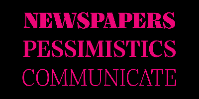
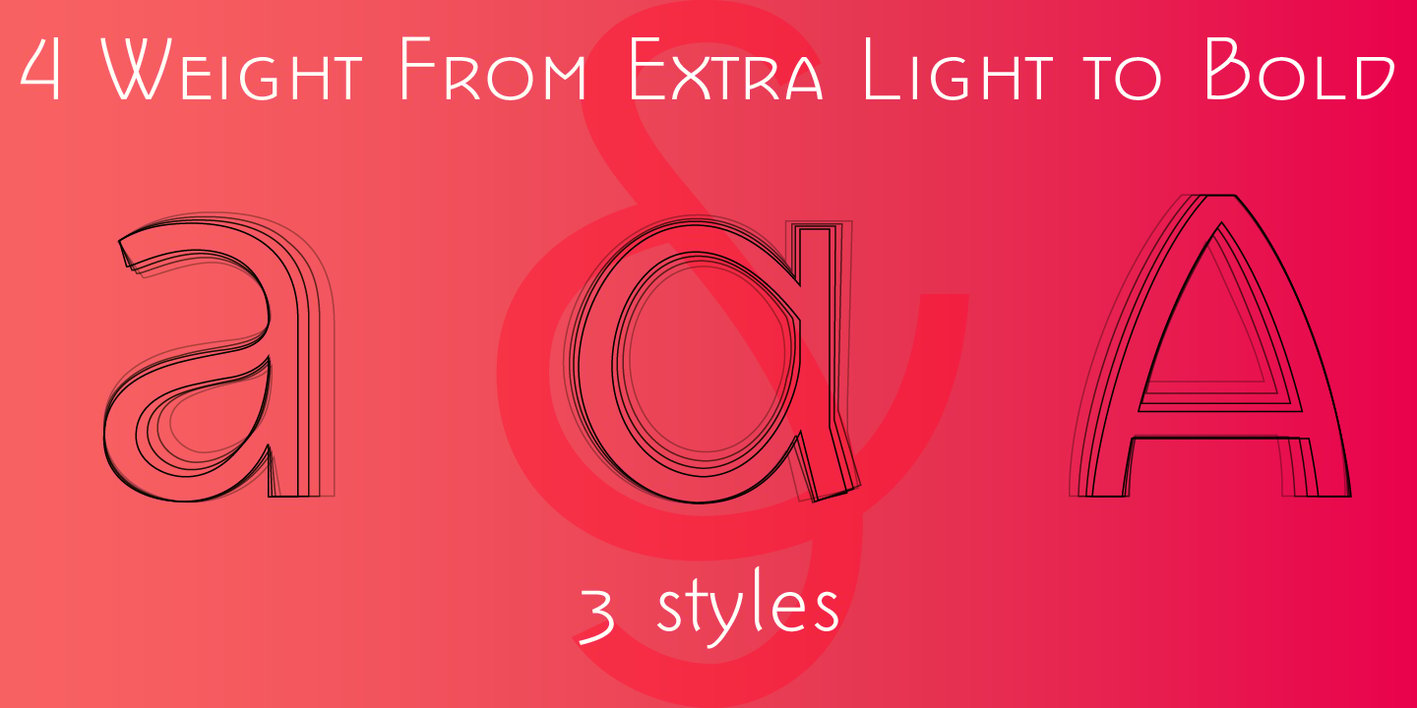
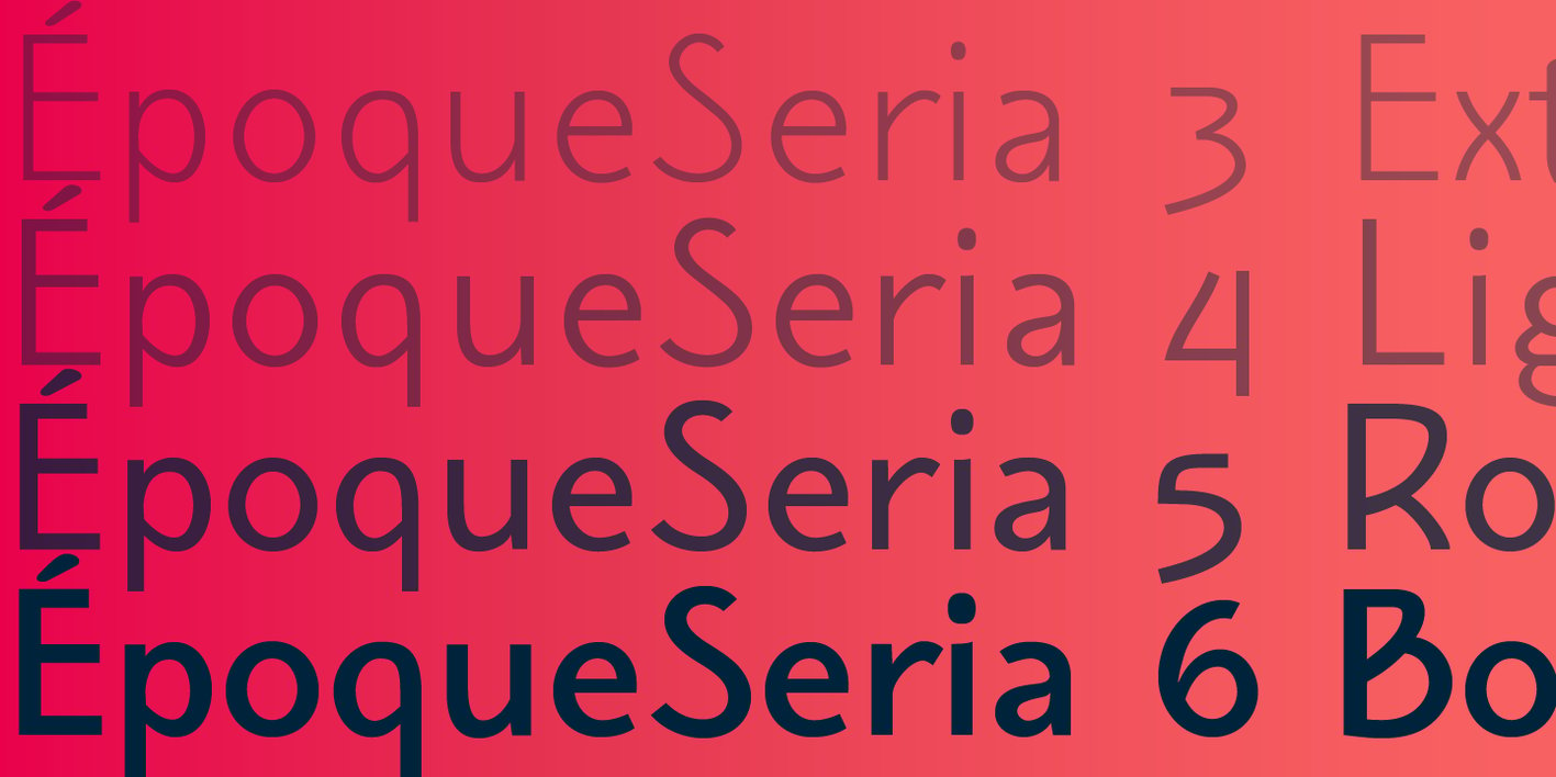
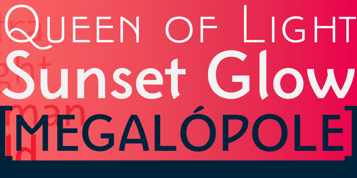
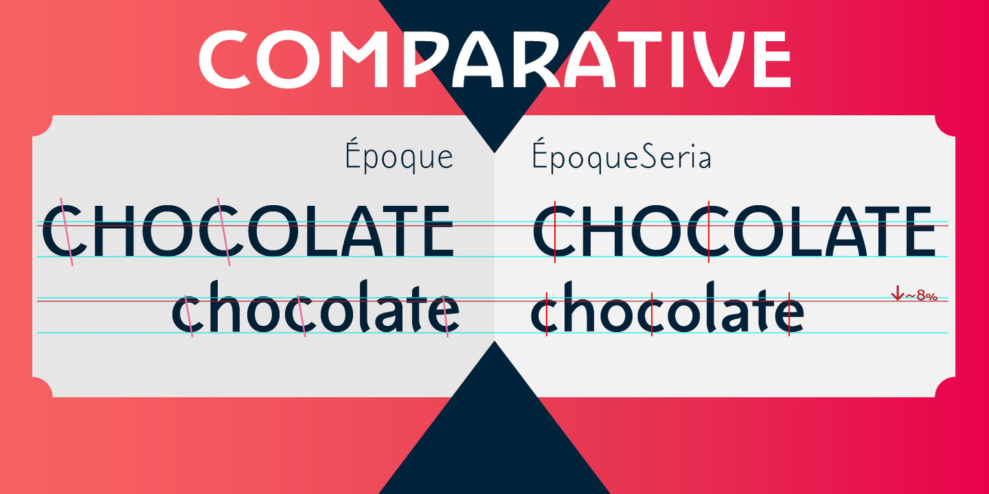
Époque Seria is that kind of person who looks really cute when angry. This font was derived from the Époque family. She is the little sister to Époque - a little shorter with her smaller x-height and — how do you say it in the typographic circle — your eyes are also smaller (and you know you squint when things get serious, isn't it?). The genealogy of these font face is undeniable, but Époque Seria has a ‘personality’ very different from her older sister. The reduction of the x-height also shakes somewhat with the cap that had crossbar. To accompany the package of standardization, the letters that don't have their straight axes were changed, which brought to the set more Cs and Gs contemporaries. In addition, other measures were taken as a greater softness in the variation of the weights and the abandonment of the black weight, being considered too heavy for this version.

VIEWS: 50