Total Post: 3,344

Choplin Font

Choplin Font Free Download


Choplin Font, Free typefaces help reduce costs for your design projects. They are a budget-friendly option, especially for small businesses, independent designers, or students.

Wide Variety: There are numerous free font resources available on the internet. By utilizing these sources, you can choose from a wide variety of fonts and select the one that best fits your project.

Boost Creativity: Free typefaces enable you to create creative projects even with a limited budget. There are many free fonts available in different styles and designs, allowing you to choose the most suitable one for your project and enhance your creativity.

Trial and Rapid Iteration: Using free typefaces allows you to quickly iterate and experiment with different fonts in your design projects. This helps you find the font that best meets the needs of your project and improves your design.

Community Contribution: Many free fonts are created and shared by independent designers or communities. This contributes to the sharing nature of the design community and increases accessibility to knowledge and resources in the design world.

Easy Access: Free fonts are often easily accessible on the internet. You can find and start using the desired font with just a few clicks online.

However, there are some points to consider when using free typefaces. For example, it is important to carefully review the font's license terms and determine usage permissions. Additionally, if your project requires a professional and corporate image, opting for paid and licensed fonts may be more appropriate.

The importance of font selection in graphic design works is significant because choosing the right font can determine the impact and communication power of the design. Here are some points highlighting the importance of font in graphic design:
Choplin Font Free Download


License: Demo for Personal Use
DMCA Contact Form: [email protected]

DESCRIPTION:

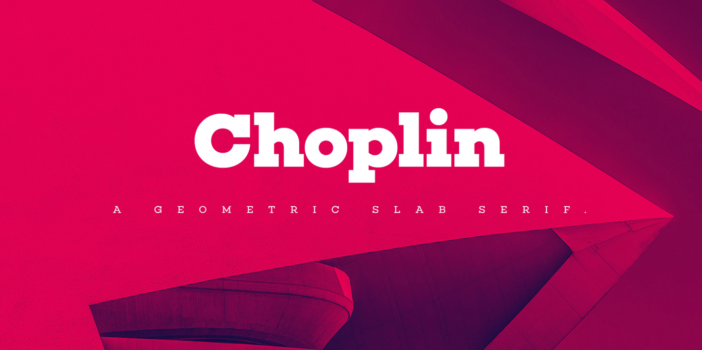
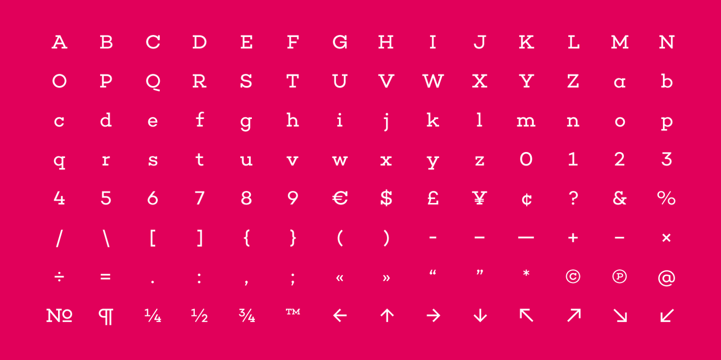
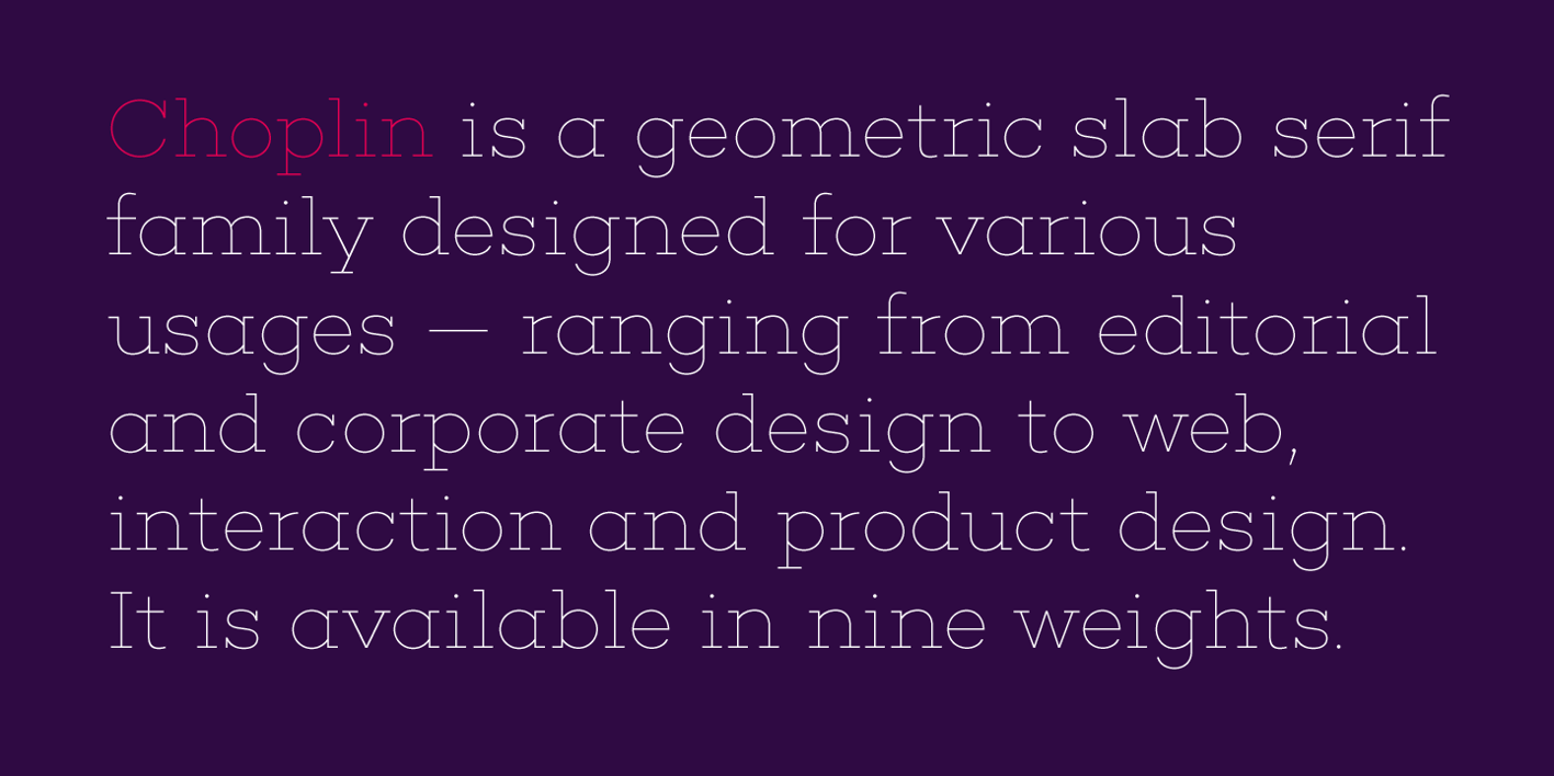
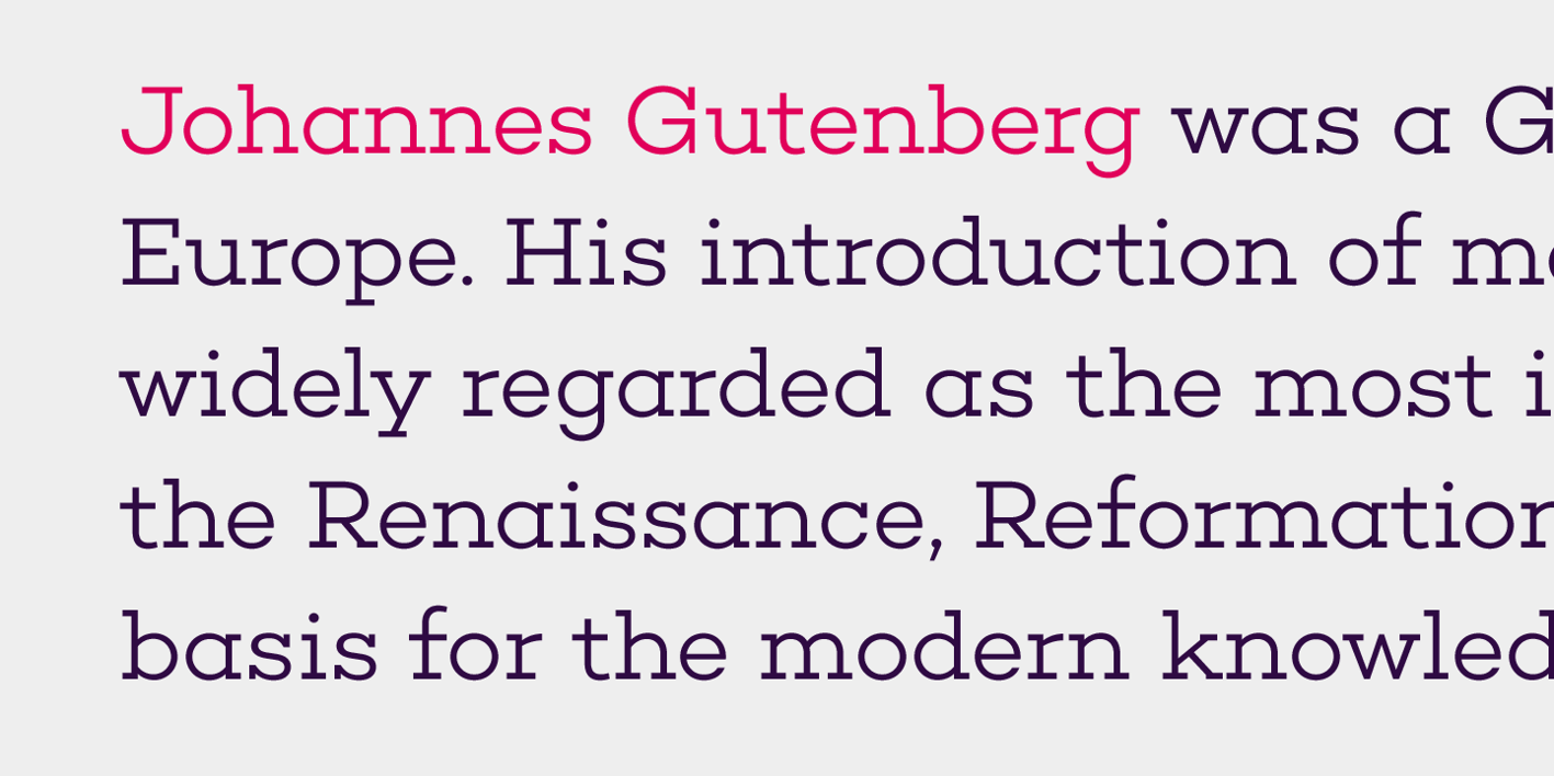
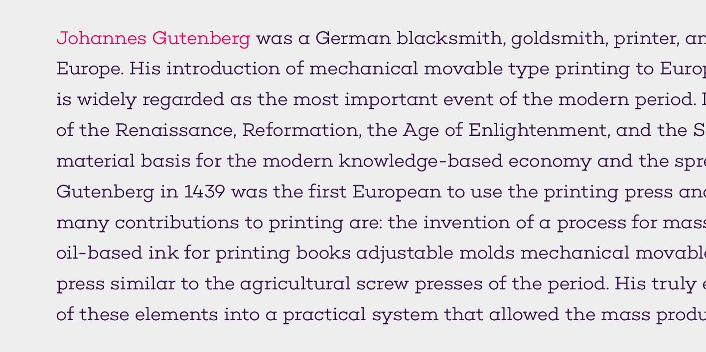
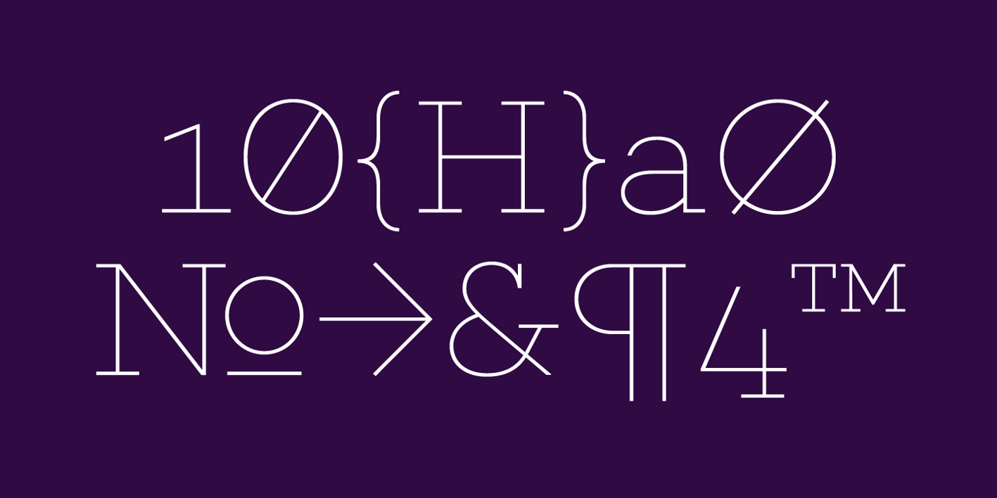
Choplin is a modern and clear geometric slab serif with a sturdy heart. It was designed based on the Campton Family, with the same principles in mind: geometry, simplicity and neutrality. As a consequence, Choplin could be seen as an immediate companion to the Campton Family. However, during the process lots of details were changed in order to sharpen the slab serif character which resulted in a slightly different interpretation. Similar to Campton, it is perfectly suited for graphic design applications ranging from editorial, corporate, web, interaction to product design. In addition, it has an extended range of alternative glyphs, ligatures and opentype features which provide flexibility and uniqueness wherever it is placed.

VIEWS: 51