
Total Post: 1,220

Bree Font


Free typefaces help reduce costs for your design projects. They are a budget-friendly option, especially for small businesses, independent designers, or students.

Wide Variety: There are numerous free font resources available on the internet. By utilizing these sources, you can choose from a wide variety of fonts and select the one that best fits your project.

Boost Creativity: Free typefaces enable you to create creative projects even with a limited budget. There are many free fonts available in different styles and designs, allowing you to choose the most suitable one for your project and enhance your creativity.

Trial and Rapid Iteration: Using free typefaces allows you to quickly iterate and experiment with different fonts in your design projects. This helps you find the font that best meets the needs of your project and improves your design.

Community Contribution: Many free fonts are created and shared by independent designers or communities. This contributes to the sharing nature of the design community and increases accessibility to knowledge and resources in the design world.

Easy Access: Free fonts are often easily accessible on the internet. You can find and start using the desired font with just a few clicks online.

However, there are some points to consider when using free typefaces. For example, it is important to carefully review the font's license terms and determine usage permissions. Additionally, if your project requires a professional and corporate image, opting for paid and licensed fonts may be more appropriate.

The importance of font selection in graphic design works is significant because choosing the right font can determine the impact and communication power of the design. Here are some points highlighting the importance of font in graphic design:


License: Demo for Personal Use
DMCA Contact Form: [email protected]

FONT NAME:
Bree Font Free Download
DESCRIPTION:

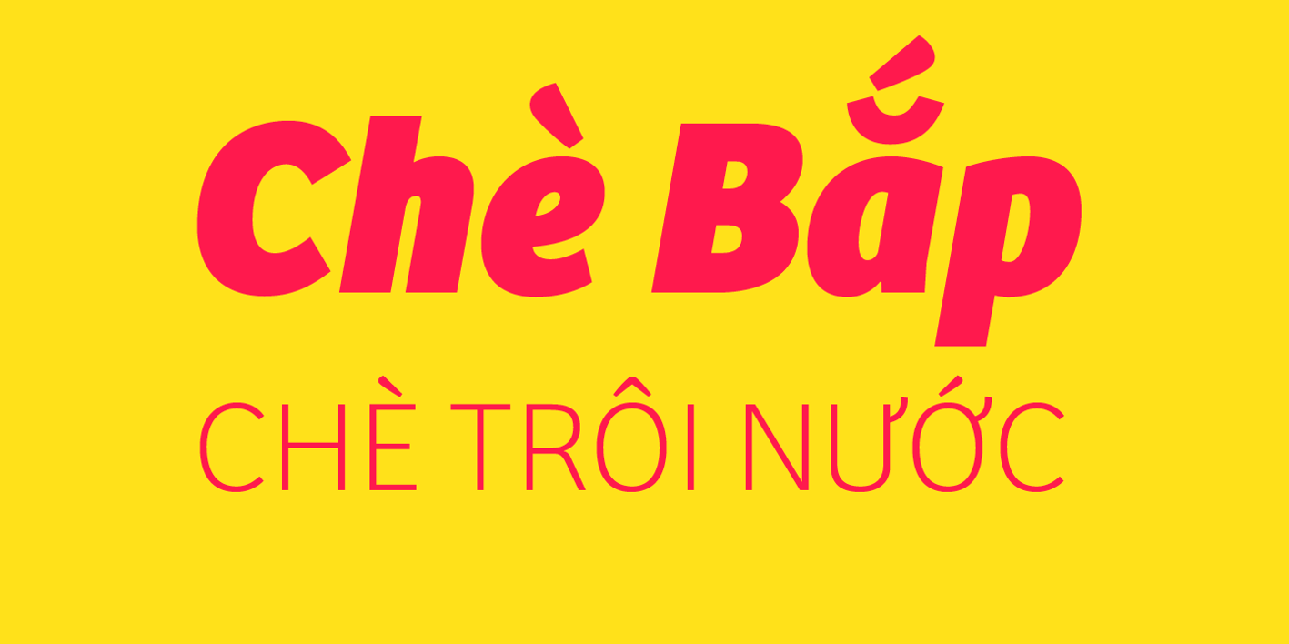
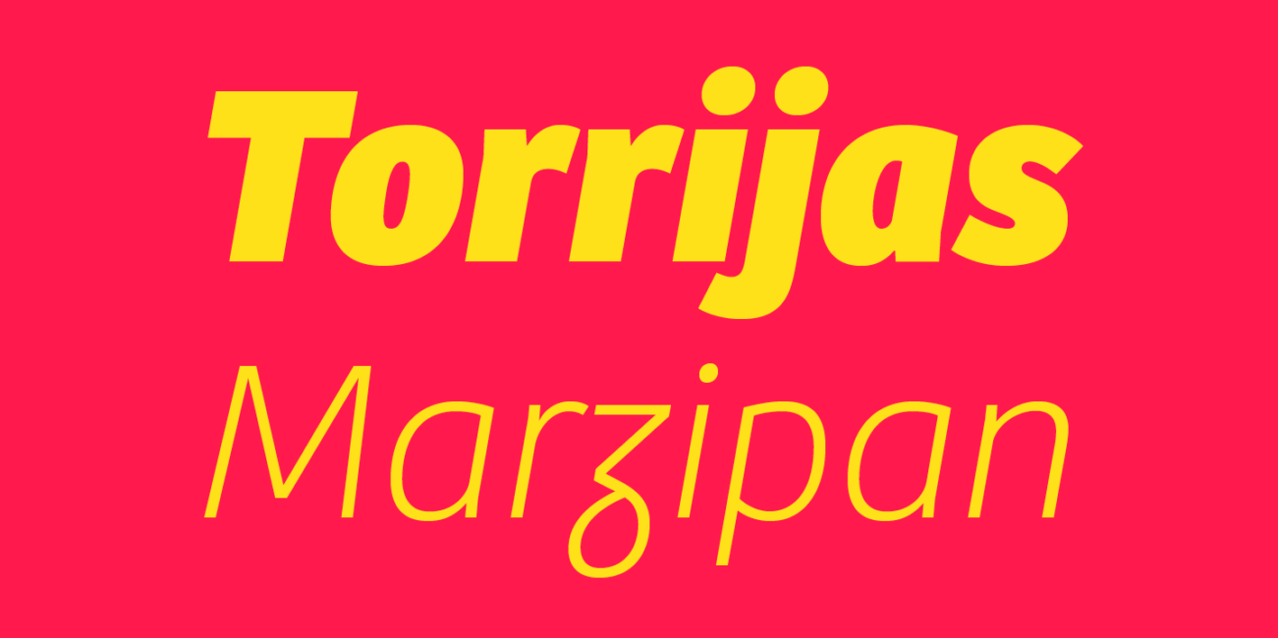
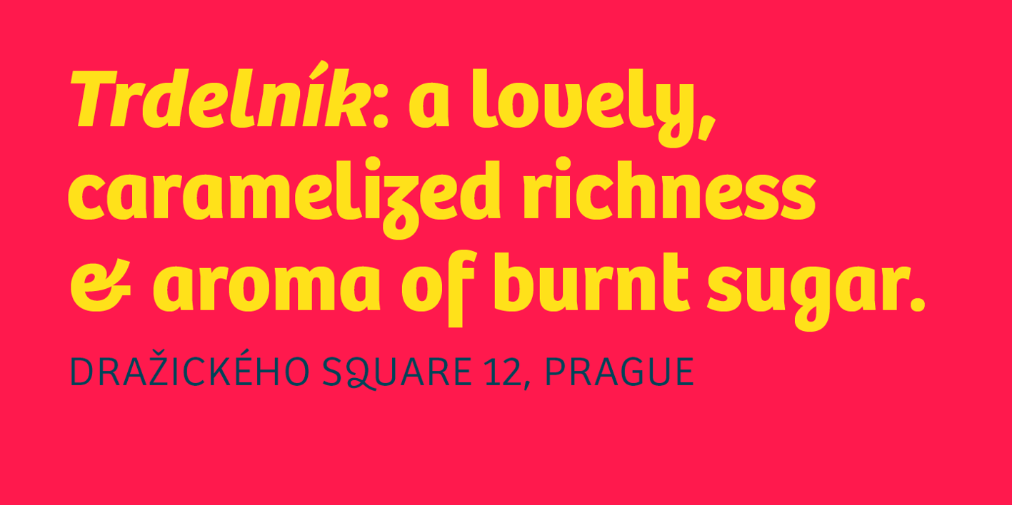
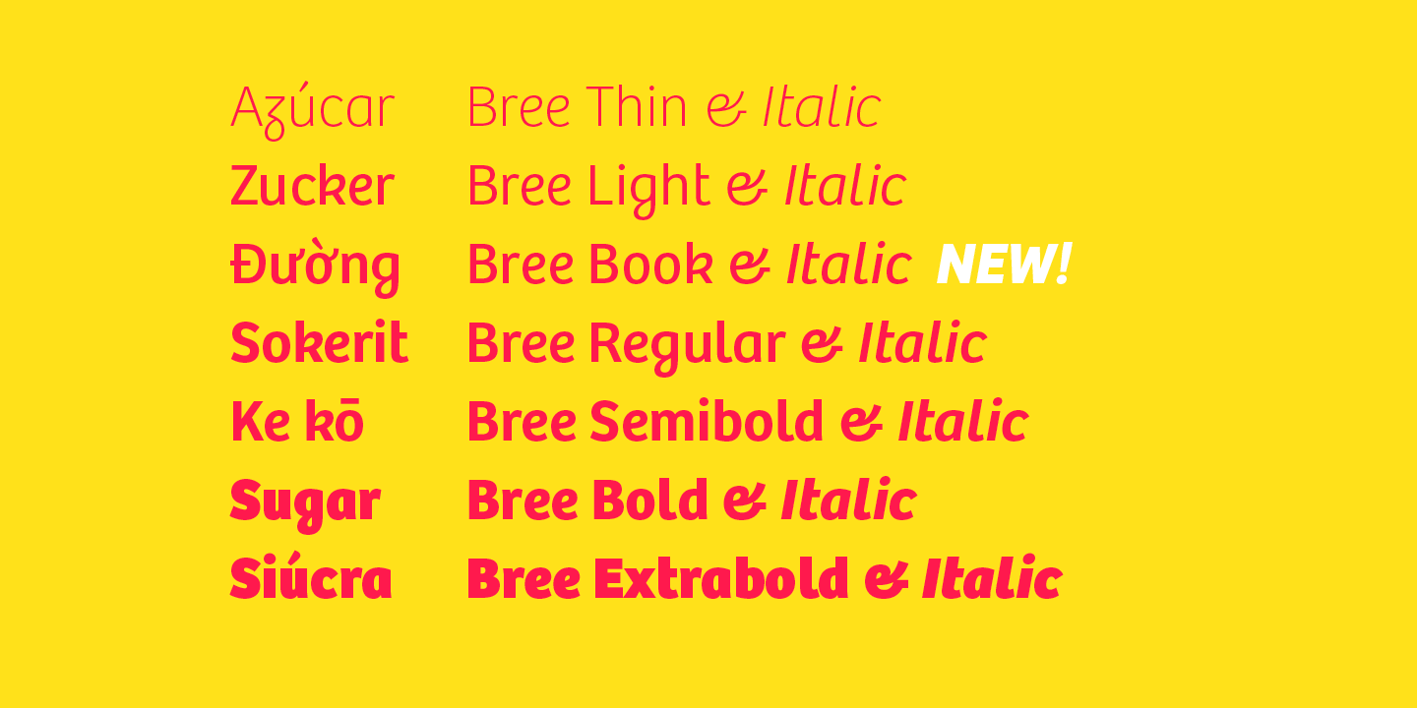
The Bree font family is a spry sans serif by Veronika Burian and José Scaglione that delivers a spirited look and feel for branding and headline usage. As an upright italic, Bree shows a pleasant mix of rather unobtrusive capitals with more vivid lowercase letters, giving text a lively appearance. Bree is clearly influenced by handwriting. As such, some of its most characteristic features are the single-story ‘a’, the cursive ‘e’, the outstroke curves of ‘v’ and ‘w’, the flourished ‘Q’, and the fluid shapes of ‘g’, ‘y’, and ‘z’. Alternates of these letters are available when a more neutral look is desired. Bree has a touch of cheekiness, a wide stance for each character, and an extra-large x-height. All this adds up to a big personality, so even when set in small text there is no skimming past the words Bree voices.

VIEWS: 61