Why Font Choice Matters in Web Design: More Than Just Pretty Letters
Why Font Choice Matters in Web Design: More Than Just Pretty Letters
In the world of web design, fonts are not just decoration — they're communication tools. The typefaces you choose impact how users feel, how they navigate, and even how they perceive your brand.
Let’s break down why choosing the right font in web design is crucial for UX, UI, and brand identity.
Fonts Shape User Experience (UX)
A font isn’t just what you see — it’s how you feel when you see it. Whether a user stays on your site or clicks away in seconds can depend heavily on readability, flow, and tone.
A clean, legible font improves comprehension, reduces eye strain, and builds trust.
Examples:
-
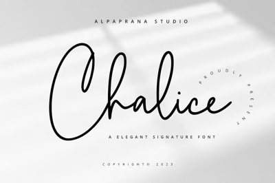
A travel blog using a flowing script font may look beautiful but frustrate readers on mobile.
-
A fintech site using a playful, bubbly font might come off as less trustworthy.
Quick Tip: Use body fonts with high x-height and generous line spacing for better readability.
Fonts Impact User Interface (UI) Clarity
In UI design, font consistency and hierarchy are key. The right typeface makes buttons pop, guides the user's attention, and creates a smooth navigation experience.
Important UI Font Traits:
-
Scalability: Responsive at all sizes
-
Weight Options: To define clear hierarchy (bold for headlines, regular for body, etc.)
-
Clarity: Even in small sizes or on low-res screens
Good UI Fonts:
-
Inter
-
Open Sans
-
SF Pro (Apple)
-
Roboto (Google)
Fonts Reflect Brand Identity
Your font choice is one of the first things users notice — often before they even read your content. Fonts convey emotion, tone, and professionalism.
Serif fonts often feel traditional and trustworthy.
Sans-serifs are modern and clean.
Handwritten fonts feel personal and expressive.
Examples:
-
A law firm might choose a classic serif like Merriweather.
-
A tech startup could go with a sleek sans-serif like Urbanist or Space Grotesk.
-
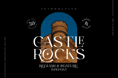
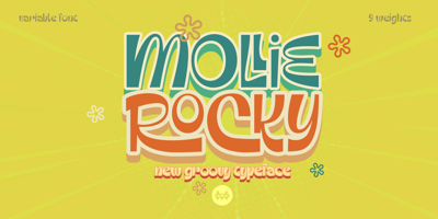
A creative agency might embrace a quirky display font to show off personality.
Accessibility and Readability Matter
Fonts that look beautiful but aren’t readable or accessible are a usability fail. Always prioritize contrast, spacing, and legibility — especially for users with visual impairments.
Accessibility Best Practices:
-
Avoid fonts with overly thin strokes
-
Use proper color contrast (AAA-compliant if possible)
-
Don’t rely on font styles alone to convey meaning (like using only italics for emphasis)
Final Words: Typography as a Design Superpower
Font selection isn’t just an aesthetic decision — it’s strategic. The right typography guides your users, tells your story, and strengthens your brand. Don’t treat it as an afterthought; treat it like the design element it truly is.
Because in web design, how you say it is just as important as what you say.


