Typography Terms Glossary: What are Kerning, Leading, and Tracking?
Typography Terms Glossary: What are Kerning, Leading, and Tracking?
Typography has its own language, and understanding key terms transforms you from someone who "makes text look nice" to a designer who can precisely control every aspect of type. Let's demystify the essential typography vocabulary, starting with the big three: kerning, leading, and tracking.
Kerning: Spacing Between Individual Letters
Kerning is the adjustment of space between two specific characters. Unlike overall spacing adjustments, kerning targets problematic letter pairs to create visually balanced text.
Why Kerning Matters
Not all letter combinations look good together. The space between "AV" looks larger than between "HI" because of their shapes. Without kerning adjustments, some letter pairs create awkward gaps or collisions.
Common Kerning Pairs
Letters with angled or curved edges often need kerning:
- AV, AW, Av, Aw - Usually need to be brought closer
- To, Ta, Te - Benefit from tighter spacing
- Yo, Ya, We - Often look better when adjusted
- LT, LV - Typically need reduction in space
When to Adjust Kerning
Always for:
- Large display text (headlines, logos)
- All-caps text
- Decorative or script fonts
Less critical for:
- Small body text (under 14pt)
- Well-designed professional fonts at standard sizes
How to Kern Properly
Look at the visual space (optical spacing), not mathematical measurements. The goal is equal perceived space, not equal measured distance. Squinting helps you see spacing issues more clearly by reducing focus on letterforms.
Leading: Space Between Lines
Leading (pronounced "ledding") is the vertical space between lines of text, measured from baseline to baseline. The term comes from traditional printing when typesetters inserted strips of lead between lines.
Why Leading Matters
Proper leading makes text comfortable to read. Too tight, and lines blur together. Too loose, and text feels disconnected and hard to follow.
Standard Leading Guidelines
The general rule is setting leading at 120-145% of your font size:
- 12pt font → 14-17pt leading
- 16pt font → 19-23pt leading
- 24pt font → 29-35pt leading
Factors That Affect Leading
Line length: Longer lines need more leading to help eyes track back to the next line.
Font characteristics: Fonts with tall x-heights need more leading. Script or condensed fonts often need even more space.
Purpose: Body text for extended reading needs generous leading. Display headlines can use tighter leading for impact.
Medium: Print can use tighter leading than screens. Digital text benefits from extra breathing room.
Too Little vs Too Much
Insufficient leading: Text feels cramped, difficult to read, causes eye fatigue. Descenders might touch ascenders from the line below.
Excessive leading: Text feels disconnected, readers lose their place, paragraphs look fragmented.
Tracking: Overall Letter Spacing
Tracking (also called letter-spacing) adjusts the space between all characters uniformly across a word, line, or paragraph. Unlike kerning which targets specific pairs, tracking affects everything equally.
When to Adjust Tracking
Increase tracking for:
- All-caps text (caps typically need 5-10% more space)
- Small caps
- Reversed text (white text on dark backgrounds)
- Narrow column widths
- Improving readability of condensed fonts
Decrease tracking for:
- Headlines that need to fit specific spaces
- Creating tighter, more impactful display text
- Justified text with awkward spacing
Common Tracking Mistakes
Too tight: Letters feel crowded, readability suffers, text looks cramped and unprofessional.
Too loose: Text loses cohesion, words feel disconnected, reading rhythm breaks down.
Tracking Units
Tracking is typically measured in units of 1/1000 em (an em is the width of the letter M in that font). Common adjustments range from -50 to +200 units depending on the situation.
Other Essential Typography Terms
Baseline
The invisible line where letters sit. Consistent baseline alignment creates order and readability. Some letters (like g, j, p, q, y) have descenders that drop below the baseline.
X-Height
The height of lowercase letters, specifically the letter x. Fonts with large x-heights appear larger and are generally more readable at small sizes. Compare Arial (large x-height) to Garamond (small x-height) at the same point size.
Ascenders and Descenders
Ascenders: The parts of lowercase letters that extend above the x-height (like b, d, f, h, k, l, t).
Descenders: The parts that extend below the baseline (g, j, p, q, y).
Fonts with long ascenders and descenders need more leading to prevent overlap between lines.
Cap Height
The height of capital letters from baseline to top. Not all caps are exactly the same height—some fonts have slightly taller caps than others.
Serif and Sans-Serif
Serif: Fonts with small decorative strokes at the ends of letterforms (Times New Roman, Garamond). Generally considered more traditional and readable for long text in print.
Sans-Serif: Fonts without those decorative strokes (Helvetica, Arial). Literally "without serif" in French. Often perceived as modern and clean.
Ligature
Two or more letters combined into a single character to improve spacing and appearance. Common ligatures include fi, fl, ff, ffi, and ffl. Professional fonts include these; basic fonts often don't.
Weight
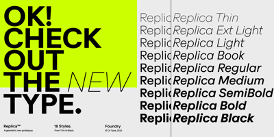
The thickness or boldness of a font. Font families typically include multiple weights: Thin (100), Light (300), Regular (400), Medium (500), Bold (700), Black (900). More sophisticated families offer even more weight options.
Italic vs Oblique
Italic: A distinct font design with different letterforms, often with calligraphic influences. True italic fonts are specially designed, not just slanted.
Oblique: Simply slanted versions of regular roman letters. Not a separate design, just mechanically skewed.
Font vs Typeface
Often used interchangeably but technically different: Typeface: The design (like Helvetica) Font: A specific style within that design (like Helvetica Bold 12pt)
In digital contexts, this distinction has blurred.
Em and En
Em: A unit of measurement equal to the current font size. In 12pt type, 1 em equals 12pt. Used for indents and spacing.
En: Half an em. Used for en-dashes (–) which are wider than hyphens but narrower than em-dashes.
Widows and Orphans
Widow: A single line of a paragraph at the top of a new page or column. Looks lonely and unprofessional.
Orphan: A single line of a paragraph left at the bottom of a page or column. Both should be avoided in professional typography.
Hierarchy
The visual organization of text elements by importance using size, weight, color, and spacing. Proper hierarchy guides readers through content naturally: headline → subhead → body text → captions.
Kerning Pairs
Pre-defined spacing adjustments built into professional fonts for common problematic letter combinations. Good fonts have hundreds of built-in kerning pairs, saving you manual adjustment work.
Point Size
The traditional measurement of type size. 72 points equal one inch. However, point size measures from the lowest descender to highest ascender, so actual visual size varies between fonts.
Putting It All Together
Understanding these terms gives you precise control over typography. Instead of saying "make the letters closer," you can say "tighten the tracking by 20 units." Instead of "more space between lines," you can specify "increase leading from 16pt to 18pt."
This precision makes collaboration with other designers easier, helps you execute your vision accurately, and elevates your work from amateur to professional.
Practice Makes Perfect
The best way to internalize these concepts is practice. Open your design software and experiment:
- Kern headline text manually
- Adjust leading on body paragraphs
- Modify tracking on all-caps text
- Compare different x-heights between fonts
Soon, you'll spot poor kerning on billboards, notice insufficient leading in brochures, and appreciate excellent tracking in magazine spreads. You'll see typography everywhere—and understand exactly what makes it work or fail.
Typography terminology isn't about being pedantic—it's about having the vocabulary to create and communicate great design precisely and professionally.


