Tips for Using Fonts Effectively in Adobe Illustrator
Tips for Using Fonts Effectively in Adobe Illustrator
Adobe Illustrator is a powerhouse for graphic design, and typography is one of its strongest tools. But with great power comes great responsibility—using fonts effectively can make or break your design. Here’s a practical guide to mastering fonts in Illustrator.
1. Choose the Right Font for the Right Purpose
Not every font fits every project. Before you start, think about the tone you want to convey:
Serif fonts for tradition and professionalism
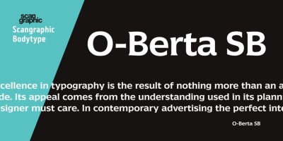
Sans-serif fonts for modern and minimal designs
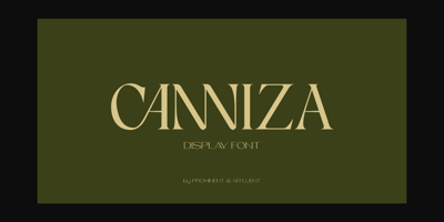
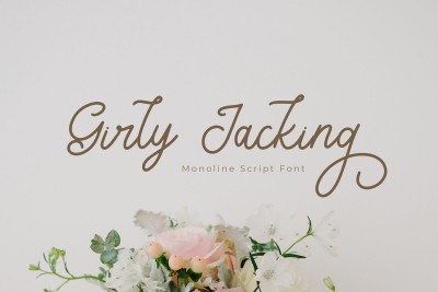
Script or display fonts for personality and creativity
Test multiple options in context to see what resonates best.
2. Use the Character and Paragraph Panels
Don’t just type and go! Open the Character and Paragraph panels (Window > Type) to fine-tune your text:
-
Adjust kerning and tracking for better letter spacing.
-
Set leading for optimal line spacing.
-
Use baseline shift for custom text effects.
These small adjustments can dramatically improve readability and balance.
3. Convert Text to Outlines for Custom Edits
Once your text is finalized, go to Type > Create Outlines to convert it into editable paths. This lets you:
Modify individual letter shapes
Apply gradients and textures inside letters
Ensure compatibility across devices (no missing fonts)
Tip: Always save a copy of the editable text before outlining, in case you need to make wording changes later.
4. Use Type on a Path for Creative Layouts
Want your text to follow a curve or shape? Use Type > Type on a Path Tool. You can make text flow along circles, waves, or custom shapes.
Use the Type on a Path Options to control alignment and spacing.
This is great for logos, badges, and poster designs.
5. Explore OpenType Features
Many fonts come with hidden treasures! In the Character panel or Glyphs panel, access OpenType features like:
Ligatures
Stylistic alternates
Swashes
Small caps
These extras add sophistication and uniqueness to your typography.
6. Don’t Overuse Effects
While Illustrator offers fun tools like Warp, Envelope Distort, and 3D Extrude, be mindful not to distort readability. Use effects sparingly and test them at different sizes.
Golden rule: If an effect compromises clarity, rethink it.
7. Group and Organize Text Layers
Keep your workspace clean by naming text layers and grouping related elements (Object > Group). This makes edits easier, especially in complex designs.
Bonus: Lock finished text layers to avoid accidental changes.
8. Pair Fonts Strategically
Good typography isn’t just about picking one nice font—it’s about combining fonts that complement each other. Follow these guidelines:
Pair serif with sans-serif for contrast.
Avoid using more than 2-3 fonts per design.
Keep hierarchy clear (headlines vs. body text).
9. Use Global Colors for Easy Updates
If you plan to use the same text color throughout, define it as a Global Color in the Swatches panel. Changing the color updates all linked text automatically.
Saves time for last-minute color tweaks.
10. Test Your Fonts in Real Context
Don’t evaluate fonts in isolation. Place them inside your actual layout—whether it’s a poster, logo, or app mockup—to see how they interact with other elements.
Print a test version to check legibility at different sizes.
Final Thoughts
Typography in Illustrator is a playground of possibilities. With these tips, you’ll not only make your fonts look better—you’ll communicate more effectively and creatively.
Experiment, trust your eye, and remember: great typography elevates great design.


