The Language of Design: How Fonts Shape Brand Identity
The Language of Design: How Fonts Shape Brand Identity
When it comes to creating a powerful brand identity, every element counts—and typography is no exception. Fonts are not just letters on a screen or paper; they convey tone, emotion, and meaning. The right font choice can make your brand instantly recognizable, while the wrong choice can confuse or alienate your audience. Let’s explore how fonts play a crucial role in shaping brand identity and how to choose the perfect typeface for your brand.
Why Fonts Matter in Branding
Fonts are often the first impression of your brand. Whether on a website, packaging, or social media post, typography sets the tone and speaks directly to your audience. Here’s why fonts are essential:
- Emotion and Tone: Fonts evoke emotions. A bold sans-serif typeface can convey strength and modernity, while a cursive script exudes elegance and sophistication.
- Brand Consistency: Using the same fonts across all platforms ensures a cohesive visual identity, making your brand easily recognizable.
- Audience Connection: Fonts can resonate with your target demographic. For instance, playful and rounded fonts might appeal to children, while sleek and minimal fonts attract a professional audience.
Examples of Font and Brand Pairing
- Coca-Cola – The iconic script font communicates nostalgia, tradition, and warmth.
- Apple – Clean, sans-serif typography reflects innovation, simplicity, and forward-thinking.
- Disney – The whimsical, custom font captures the magic and imagination the brand represents.
These examples show how fonts go beyond aesthetics; they embody a brand’s personality and values.
How to Choose the Right Font for Your Brand
Selecting the perfect font requires a thoughtful approach. Here are some tips:
-
Understand Your Brand Personality Is your brand playful or serious? Luxurious or accessible? Identifying your core values will help you narrow down font styles that align with your identity.
-
Consider Readability A beautiful font that’s hard to read can defeat its purpose. Ensure your chosen typeface is legible across all mediums, from digital screens to print materials.
-
Mix and Match Carefully Pair fonts strategically. A primary and secondary font combination can add depth to your designs. For instance, a serif font for headings and a sans-serif for body text often creates a harmonious balance.
-
Test Across Mediums Your font should look great on every platform. Test it on your website, business cards, and social media graphics to ensure consistency.
The Psychology of Fonts
Different font styles evoke specific emotions:
- Serif Fonts: Classic, trustworthy, and professional. Great for law firms and academic institutions.
- Sans-Serif Fonts: Modern, clean, and approachable. Popular with tech companies and startups.
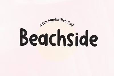
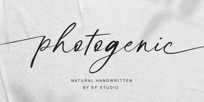
- Script Fonts: Elegant, creative, and personal. Ideal for wedding brands or luxury products.
- Display Fonts: Bold and unique. Perfect for brands that want to stand out and make a statement.
Conclusion
Fonts are the silent ambassadors of your brand. They communicate who you are before a single word is read. By understanding the emotional and psychological impact of typography, you can craft a brand identity that resonates deeply with your audience. Choose wisely, and let your fonts speak volumes about your brand.


