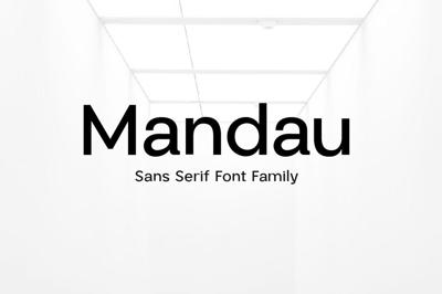
Serif vs Sans-Serif: When and Where to Use Each Font Style
Serif vs Sans-Serif: When and Where to Use Each Font Style
Fonts are more than just design elements—they're powerful communicators. Among the most fundamental distinctions in typography is the one between serif and sans-serif fonts. If you've ever struggled to choose between them, you're not alone. Each style serves a unique purpose, and knowing when to use which can make or break your design.
In this post, we’ll explore the differences between serif and sans-serif fonts, when to use them, and how they impact readability, branding, and overall design tone.
What’s the Difference?
Serif Fonts
Serif fonts have small “feet” or decorative lines at the ends of characters. These fonts are considered more traditional, formal, and elegant.
Examples:
-
Times New Roman
-
Georgia
-
Garamond
-
Playfair Display
Sans-Serif Fonts
Sans-serif (literally “without serif”) fonts have clean, straight edges with no embellishments. They're seen as modern, minimal, and highly readable, especially on screens.
Examples:
-
Helvetica
-
Arial
-
Roboto
-
Open Sans
The Psychology Behind the Styles
Typography plays a psychological role in how people perceive your message. Here’s what each style subconsciously communicates:
| Style | Tone Perception |
|---|---|
| Serif | Trustworthy, established, academic, literary |
| Sans-Serif | Clean, modern, efficient, tech-savvy |
Knowing this, your choice should align with your audience’s expectations and your brand personality.
When to Use Serif Fonts
Serif fonts are especially effective when you want to convey:
-
Authority and Tradition: Ideal for law firms, universities, luxury brands.
-
Elegance and Class: Perfect for print materials like books, magazines, and wedding invitations.
-
Long-Form Reading: Serifs help guide the eye across lines, making them excellent for printed body text.
Great Use Cases:
-
Editorial layouts (Playfair Display for titles, Georgia for body)
-
Print publications
-
Formal invitations
-
Heritage or luxury branding
When to Use Sans-Serif Fonts
Sans-serif fonts shine in modern digital environments where clarity and functionality are key.
Use them when you want to express:
-
Simplicity and Efficiency: Great for tech companies, startups, minimalist branding.
-
Modernity and Innovation: Widely used in UX/UI design for apps and websites.
-
Screen Readability: Their clean lines make them easier to read at smaller sizes.
Great Use Cases:
-
Websites and mobile apps (e.g., Inter, Roboto)
-
Digital ads and presentations
-
Corporate reports
-
Modern logos
Can You Mix Serif and Sans-Serif?
Absolutely—and it can be powerful! Pairing a serif headline with sans-serif body text (or vice versa) creates contrast and visual hierarchy.
Example Combos:
-
Playfair Display (Serif) + Source Sans Pro (Sans-Serif)
-
Libre Baskerville (Serif) + Lato (Sans-Serif)
-
Merriweather (Serif) + Montserrat (Sans-Serif)
These combos are great for blogs, online magazines, and landing pages.
Common Mistakes to Avoid
-
Using too many fonts at once: Stick to one or two font families to avoid a chaotic look.
-
Not considering the medium: Serif may look great on print but pixelated on some screens.
-
Ignoring accessibility: Sans-serif fonts often work better for users with visual impairments.
Tools to Explore
-
Google Fonts – Free, web-friendly serif and sans-serif options
-
FreeForFonts.com – Curated library of free fonts with visual previews
-
Typewolf – Real-world font pairing inspiration
-
Font Pair – Suggests pairings between serif and sans-serif fonts
Final Thoughts
There’s no universal rule that says serif is better than sans-serif—or vice versa. It all comes down to purpose, audience, and platform.
Use serif fonts when you want depth, tradition, and print-friendly sophistication. Use sans-serif fonts for clarity, simplicity, and screen readability. Or be bold—combine both for a beautiful balance of classic and modern.
Typography isn’t about rules. It’s about rhythm, feeling, and connection.
Because when the font is right, the message sings.


