Retro and Vintage Font Combinations
Retro and Vintage Font Combinations
There's something magical about retro and vintage typography. These styles transport us to different eras, evoke nostalgia, and add character that modern fonts sometimes lack. Whether you're designing for a brand, poster, or package, mastering retro font combinations can set your work apart.
Understanding Retro vs Vintage
While often used interchangeably, these terms have subtle differences. Vintage typically refers to authentic designs from past decades, while retro describes modern designs inspired by those eras. Both styles celebrate the typography of yesteryear, from the roaring '20s to the groovy '70s.
Classic Era-Specific Combinations
The 1920s Art Deco Look
Art Deco typography screams elegance and glamour. Pair geometric, elongated display fonts with refined serif body text. Think tall, narrow letterforms with decorative elements for headlines, balanced by classic serifs like Garamond or Baskerville for readability.
This combination works beautifully for luxury brands, wedding invitations, and anything requiring sophistication with a vintage twist.
1950s Diner Aesthetic
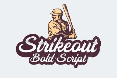
The '50s brought us chrome, neon, and optimistic Americana. Combine bold, rounded script fonts with chunky sans-serifs. Think hand-lettered signs paired with thick, friendly typefaces that evoke diners, jukeboxes, and classic cars.
Add drop shadows and outlines to enhance that authentic mid-century feel.
1960s Psychedelic Vibes
The '60s went wild with typography. Pair flowing, organic display fonts with groovy bubble letters. These fonts often feature wavy baselines, playful curves, and unexpected flourishes that capture the era's experimental spirit.
Balance these eye-catching display fonts with simpler supporting text to prevent visual overwhelm.
1970s Disco Era
Thick, bold fonts dominated the '70s. Combine chunky serif display fonts with rounded, friendly sans-serifs. Think Cooper Black paired with something like Avant Garde Gothic—fonts that are unapologetically bold and confident.
Earth tones and warm color palettes complement these combinations perfectly.
1980s Neon Dreams
The '80s brought us geometric sans-serifs, chrome effects, and neon everything. Pair angular, futuristic display fonts with clean, modern supporting typefaces. Fonts with sharp angles and tech-inspired aesthetics capture this era's essence.
Don't forget the visual effects—gradients, glows, and metallic finishes complete the look.
Universal Vintage Pairing Strategies
Script and Sans-Serif
This timeless combination never fails. A elegant script font for headlines paired with a clean sans-serif for body text creates beautiful contrast. The script adds personality and warmth, while the sans-serif ensures readability.
Choose scripts that aren't overly ornate—legibility should never be sacrificed for style.
Slab Serif and Script
Slab serifs have that Western, hand-crafted feel perfect for vintage designs. Pairing a bold slab serif with a flowing script creates dynamic tension. This combination works especially well for rustic, handmade, or artisanal brands.
Decorative Display and Simple Serif
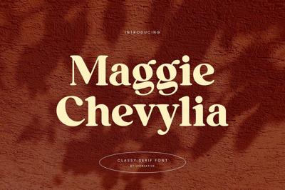
Let your display font be the star. Choose an ornate, vintage-inspired display font for headlines, then balance it with a straightforward serif for body text. This keeps your design interesting without becoming chaotic.
Getting the Details Right
Texture and Effects
Authentic vintage looks often include distressed textures, halftone patterns, or subtle grain. These effects make your typography feel genuinely aged rather than digitally perfect. Use them sparingly—too much distressing looks forced.
Color Palettes Matter
Retro designs benefit from period-appropriate colors. Muted pastels for the '50s, earth tones for the '70s, neon brights for the '80s. Your font combinations work best when supported by historically accurate color choices.
Spacing and Layout
Vintage designs often featured tighter spacing and more compact layouts than modern standards. Don't be afraid to bring elements closer together, but always maintain readability.
Common Mistakes to Avoid
Mixing Too Many Eras
Stick to one era at a time. Combining Art Deco with '80s neon creates confusion rather than cohesion. Choose your period and commit to it fully.
Ignoring Hierarchy
Even retro designs need clear visual hierarchy. Your most important text should be immediately obvious through size, weight, or placement.
Overdoing Effects
Vintage effects are seasoning, not the main dish. Use distressing, shadows, and decorative elements thoughtfully. When everything has effects, nothing stands out.
Modern Applications
Retro and vintage typography isn't just for throwback projects. Modern brands use these styles to convey authenticity, craftsmanship, and timeless quality. Coffee shops, breweries, barbershops, and boutiques frequently embrace vintage typography to differentiate themselves.
Final Thoughts
Mastering retro and vintage font combinations requires understanding history, respecting era-specific aesthetics, and knowing when to break the rules. These styles offer richness and personality that pure modern typography sometimes lacks.
Experiment with different decades, study authentic vintage designs, and don't be afraid to put your own contemporary spin on classic combinations. The best retro typography honors the past while feeling fresh today.
