How to Choose the Right Font to Match Your Brand Personality
How to Choose the Right Font to Match Your Brand Personality
Your choice of font is arguably the most powerful, yet often overlooked, element of your brand identity. It’s not just about selecting something that looks "nice." A typeface is a psychological tool—it instantly communicates your brand’s tone, values, and reliability to the customer.
Think of it this way: your brand's font is the visual equivalent of your voice. Are you speaking in a classic, resonant tone, or a quick, modern whisper? The right selection can establish trust and professionalism; the wrong one can create a disconnect that makes your entire message feel amateur.
To move beyond simply picking a pretty font, you must learn to decode the emotional language of typography. Here is a definitive, step-by-step guide on how to choose the right font to truly match your brand personality.
Phase 1: Decoding Your Brand’s DNA
You cannot choose a font until you have a crystal-clear understanding of your brand’s character. This is the foundation of your typographic strategy.
Start by asking these three essential questions about your brand:
-
What is our primary tone? (e.g., Serious, Playful, Elegant, Energetic.)
-
What is our position in the market? (e.g., Traditional, Modern, Futuristic, Nostalgic.)
-
What is our promise to the customer? (e.g., Trust, Accessibility, Luxury, Speed.)
Once you have the answers, you can start looking for fonts that embody these traits:
| If Your Brand Is... | Look For... |
| Established & Trustworthy | Classic Serifs (like Garamond). Fonts with high contrast and historical feel. |
| Modern & Minimalist | Geometric Sans-serifs (like Futura or Montserrat). Fonts with clean, monolinear structure. |
| Friendly & Accessible | Rounded Sans-serifs (like Quicksand or Open Sans). Handwritten styles. |
| Bold & Industrial | Heavy Slab-serifs (like Arvo). Condensed, assertive Sans-serifs (like Oswald). |
Phase 2: Mastering the Three Typographic Voices
Every font falls into one of three core categories, each carrying an immediate, powerful psychological message.
1. Serif Fonts: The Voice of Authority
Serifs have the small feet or decorative strokes at the end of the letterforms. They are inherently linked to the history of print and classical literature.
-
Personality: Traditional, Respected, Formal, and Luxurious.
-
Best For: Any field where heritage and trust are paramount—such as legal, finance, luxury fashion, publishing, and university branding. They work exceptionally well in print.
2. Sans-Serif Fonts: The Voice of Clarity
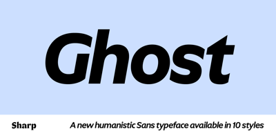
These fonts are clean, lacking the decorative feet (sans is "without"). They gained popularity with the rise of modernism and technology.
-
Personality: Modern, Minimalist, Efficient, and Accessible.
-
Best For: The digital world. They are the standard for web body text, app interfaces (UI/UX), tech companies, fitness brands, and modern startups because their clean lines render perfectly on screens.
3. Display & Script Fonts: The Voice of Character
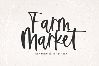
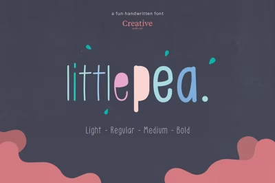
These are highly specialized fonts (handwritten, grunge, retro styles) designed for visual impact, not extensive reading.
-
Personality: Expressive, Artistic, Unique, and Personal.
-
Best For: Used sparingly for logos, titles, short taglines, and packaging where you need a strong, immediate emotional reaction (e.g., a handwritten script for a bakery logo).
-
Rule: Never use these for paragraphs of text.
-
Phase 3: The Deep Dive—Analyzing Micro-Features
Once you've narrowed your search to a category (e.g., Sans-Serif), you need to analyze the micro-features that separate a common font from one that perfectly aligns with your brand.
A. Line and Stroke Variation (Contrast)
-
High Contrast: Thick main strokes and very thin connecting lines (common in elegant serifs). This screams Luxury and High Fashion.
-
Monolinear: Strokes are uniform in thickness (common in modern sans-serifs). This conveys Clarity, Consistency, and Technical Precision.
B. Geometry and Terminals
-
Geometric Shapes: Fonts built on perfect circles and triangles (like Futura) feel rational, engineered, and professional.
-
Humanist Forms: Fonts with slight variations and open forms (like Open Sans) feel warm, friendly, and approachable.
C. Weight and Scale (X-Height)
-
Bold/Condensed Weight: Projects Strength, Urgency, and Impact. (Good for sports or news headlines).
-
High X-Height: The height of the lowercase letters is proportionally tall. This is critical for readability at small sizes (like on a mobile app) and feels more open.
Phase 4: The Final Context Test
Never select a font based only on the alphabet preview. You must see it in action.
-
Test the Hierarchy: Create a sample page with a headline, a subheading, and three paragraphs of body text. Does your chosen font clearly delineate these roles?
-
Test the Pairing: If you are using two fonts (a common best practice), ensure they contrast in category (Serif vs. Sans-Serif) but harmonize in mood (a formal serif should be paired with a clean, not goofy, sans-serif).
-
Test the Scale: Preview your font at a large logo size (72pt) and a small body text size (12pt). If the font loses its readability or personality at either extreme, keep searching.
By approaching typography strategically, you ensure your font is a powerful asset that works tirelessly to reinforce your brand’s personality and communicate trust and quality to every customer.


