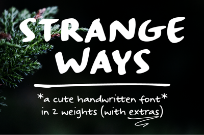
Google Fonts vs. Free Independent Fonts: Which Should You Choose?
Google Fonts vs. Free Independent Fonts: Which Should You Choose?
When it comes to free fonts, designers are spoiled for choice. But not all free fonts are created equal—especially when deciding between the expansive library of Google Fonts and the unique world of independent free fonts. So, which should you pick? Let’s break it down.
What is Google Fonts?
Google Fonts is a free, open-source collection of fonts hosted by Google. It offers over 1,500 typefaces that can be used for web and print, easily embedded into websites via a simple line of code.
Pros:
-
Reliable hosting and fast loading for web use
-
Consistent licensing (open source for commercial and personal use)
-
Easy integration with CSS and design tools
-
Wide compatibility across browsers and platforms
Cons:
-
Many fonts are overused
-
Less experimental or artistic variety compared to niche sources
What Are Free Independent Fonts?
Free independent fonts are designed and distributed outside large platforms, often by individual type designers. They can be found on sites like DaFont, Behance, or personal designer websites.
Pros:
-
Unique, less commonly used fonts
-
Greater diversity in styles, including experimental and artistic typefaces
-
Opportunity to support individual designers by promoting their work
Cons:
-
Licensing may vary—some free only for personal use
-
Potential quality inconsistencies (not all fonts have full character sets or professional kerning)
-
No centralized hosting for web use; you may need to self-host
When to Choose Google Fonts
Opt for Google Fonts if you need:
-
A reliable, fast-loading font for websites
-
Clear, hassle-free licensing for commercial projects
-
Easy pairing with other Google Fonts for consistency
-
Widely supported fonts that work across devices
Google Fonts are great for web designers, developers, and projects where functionality, speed, and compatibility are top priorities.
When to Choose Free Independent Fonts
Choose independent fonts if you want:
-
A distinctive, unique look to stand out from mainstream designs
-
Fonts tailored to a specific niche, theme, or artistic style
-
More experimental or hand-crafted typefaces
Independent fonts shine in branding, posters, editorial work, or personal projects where originality matters more than scalability.
Things to Watch Out For
-
Licensing: Always double-check if “free” means free for commercial use or only personal use.
-
Character set: Ensure the font includes the glyphs, accents, and symbols you need.
-
Quality: Look for fonts with proper kerning, spacing, and balance—especially in indie fonts.
Can You Combine Both?
Absolutely! Many designers mix Google Fonts with independent fonts:
Use Google Fonts for body text (for readability and performance)
Use an indie display font for headlines or logos (for uniqueness)
This hybrid approach can balance functionality and creativity.
Final Verdict
There’s no one-size-fits-all answer. If you prioritize web performance, licensing ease, and broad compatibility, Google Fonts is a safe bet. If you’re chasing uniqueness, artistic flair, or niche appeal, free independent fonts may be worth the extra effort.
The best choice depends on your project’s goals, audience, and platform. Don’t be afraid to experiment—and always read the fine print!
