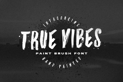
Differences Between Font Types: Serif, Sans-Serif, Display
Differences Between Font Types: Serif, Sans-Serif, Display
Choosing the right font for your project can significantly influence the tone and readability of your design. Understanding the differences between font types like serif, sans-serif, and display fonts will help you make an informed decision. Here’s a guide to these font categories and their key characteristics.
1. Serif Fonts
What Are They?
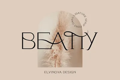
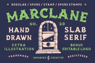
Serif fonts are characterized by small lines or strokes (called serifs) attached to the ends of the letters. These fonts have a traditional and elegant appearance.
Key Features:
- Decorative strokes or "feet" at the ends of letters.
- Often associated with print media.
- Creates a sense of formality and trust.
Best For:
- Books, newspapers, and magazines.
- Professional and academic documents.
- High-end branding.
Examples:
- Times New Roman
- Georgia
- Garamond
2. Sans-Serif Fonts
What Are They?
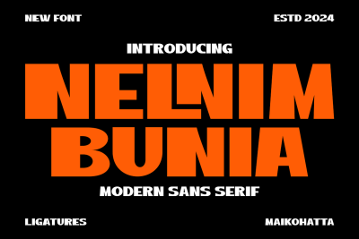
Sans-serif fonts do not have the decorative strokes found in serif fonts. Their clean and modern look makes them highly versatile.
Key Features:
- Simple and minimalist letterforms.
- Excellent readability on digital screens.
- Conveys a sense of modernity and approachability.
Best For:
- Websites and mobile applications.
- Presentations and marketing materials.
- Informal branding.
Examples:
- Arial
- Helvetica
- Open Sans
3. Display Fonts
What Are They?
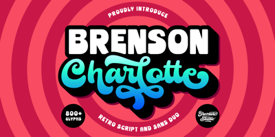
Display fonts are designed for large sizes and are often highly decorative or stylized. They aim to attract attention and make a statement.
Key Features:
- Bold, artistic, or intricate designs.
- Limited readability in smaller sizes.
- Meant for headlines, titles, or logos.
Best For:
- Posters and advertisements.
- Branding and logo design.
- Event invitations.
Examples:
- Lobster
- Pacifico
- Bebas Neue
How to Choose the Right Font Type
-
Understand Your Audience:
- Use serif fonts for a professional or formal audience.
- Opt for sans-serif fonts for younger, tech-savvy audiences.
- Choose display fonts for creative or bold statements.
-
Match the Mood:
- Serif: Traditional and trustworthy.
- Sans-Serif: Modern and clean.
- Display: Eye-catching and unique.
-
Consider the Medium:
- Serif fonts excel in print.
- Sans-serif fonts are better for digital screens.
- Use display fonts sparingly and for emphasis.
-
Combine Font Types:
- Pair serif and sans-serif fonts for contrast.
- Use display fonts only for headlines or highlights.
Conclusion
Each font type has unique strengths and is suited to specific contexts. By understanding the differences between serif, sans-serif, and display fonts, you can create designs that are both visually appealing and functional. Experiment with combinations and find the perfect balance for your project. Have a favorite font type or pairing? Let us know in the comments below!

