Beyond Google Fonts: Discover Hidden Gems on freeforfonts.com
Beyond Google Fonts: Discover Hidden Gems on freeforfonts.com
Google Fonts is the undisputed king of free typography. It’s reliable, massive, and every font is commercially licensed. But let's face it: if you're a designer who wants a unique brand identity, relying solely on fonts used by millions of websites and projects can leave your work feeling a little... well, generic.
The key to escaping the "Roboto rut" is knowing where to look for those unique, high-quality typefaces that haven't been overused. That's where curated platforms, like freeforfonts.com, step in. These sites showcase independent designers and smaller foundries, offering a wealth of original typefaces that can give your creative projects a distinctive edge.
If you’re ready to move past the basics and inject some personality into your next design, here is a guide on how to dig deeper and discover the hidden gems that truly stand out.
The Limitations of the King
Google Fonts is fantastic for body copy, web performance, and foolproof legibility. However, its core strength (consistency and neutrality) is also its weakness.
-
Limited Display Options: Google Fonts tends to be light on truly unique Display fonts—those expressive, bold typefaces perfect for high-impact logos or posters.
-
Over-Saturation: Popular fonts like Open Sans, Montserrat, and Poppins are everywhere. Using them for your brand's primary visual identity can make you look exactly like your competitors.
-
Niche Styles: If you need a font with a specific retro feel, a highly stylized script, or a chunky slab-serif with distinct character, you often need to look elsewhere.
How to Mine for Gold on freeforfonts.com
To find those unique typefaces, you need to use a different set of criteria than the standard search for "most popular" or "best-performing." You’re looking for character and uniqueness.
1. Focus on Specific Categories
Instead of browsing the general "Sans-Serif" category, dive deep into specialized classifications that guarantee flair:
-
Display: These fonts are designed to be large and arresting. They include experimental, geometric, or heavily stylized typefaces that make fantastic headers and logos. They are built for impact, not reading efficiency.
-
Slab-Serif: These typefaces have thick, block-like serifs, giving them a heavy, often vintage or industrial feel (think Memphis or old Western posters). They are less common than traditional serifs but offer immense personality.
-
Script & Handwritten: Skip the basic scripts and look for brush fonts, messy handwriting styles, or elegant signature fonts. These are perfect for adding a personal, human touch to any piece.
2. Look Beyond the Regular Weight
A true hidden gem is often part of a fully developed font family. When you click on a font, don’t just look at the Regular weight preview.
-
Check the Number of Weights: Does the font come with Thin, Light, Medium, Bold, and Black weights? A full family shows that the designer put effort into consistency and versatility.
-
Stylistic Alternates: High-quality fonts often include alternate characters (different versions of letters like a, g, or t) or ligatures (combined letters like fi or fl). These details make a huge difference in professionalism and allow you to subtly customize the look.
3. Vet the Licensing for Independent Foundries
While freeforfonts.com strives for accuracy, whenever you download a font from an individual creator or a smaller foundry linked on the site, take one extra minute to confirm the license.
-
Look for a README File: The downloaded ZIP folder should contain a text file named
LICENSEorREAD ME. This document confirms whether you can use the font for commercial projects. -
"Free Demo" Warning: Some unique fonts are offered as a "Free Demo" with only the Regular weight and limited character sets. This is often a way to entice you to buy the full version. If you need the full family, be prepared to search for another fully free alternative.
Three Examples of Hidden Gem Categories to Explore
| Category | Design Vibe | Project Suitability |
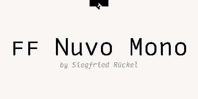
| Monospace | Tech, Coding, Vintage Typewriter | App UIs, Data Visualization, Retro Branding |
| Geometric Display | Art Deco, Futuristic, Architectural | Posters, Event Branding, Luxury Logos |
| Brush Script | Casual, Artistic, Energetic | T-Shirt Designs, Social Media Graphics, Informal Headers |
The Payoff: A Unique Brand Voice
Ultimately, moving "Beyond Google Fonts" is about finding a voice that is uniquely yours. When you find that perfect geometric display font for your website’s hero section, or that chunky slab-serif that makes your print materials pop, you are investing in differentiation.
Don't settle for the easy, common choices. Use the curated resources available on sites like freeforfonts.com to find the unique typefaces that professionals use to craft memorable, high-impact designs. Your next project deserves a font that hasn't been seen everywhere else!


