Beginner’s Guide to Typography: What Is a Font and How Do You Choose One?
Beginner’s Guide to Typography: What Is a Font and How Do You Choose One?
Typography is everywhere—from your favorite websites to the books you read and even the ads you scroll past. But if you're new to design or just starting to explore the creative world of fonts, it can be overwhelming to know where to begin. In this beginner-friendly guide, we’ll break down the basics of typography, explain what a font really is, and share practical tips for choosing the right one for your project.
What Is Typography, Really?
Typography is the art and technique of arranging type to make written language not only legible, but also visually appealing. It includes everything from the style of the letters to how text is spaced and organized.
Whether you're creating a brand identity, building a website, or making an Instagram post, your choice of typography affects how your audience feels about your content.
Font vs. Typeface: What’s the Difference?
These two terms are often used interchangeably, but they’re not exactly the same.
-
Typeface is the overall design of the letters (e.g., Helvetica, Times New Roman).
-
Font refers to the specific style and weight within that typeface (e.g., Helvetica Bold Italic, 12pt).
Think of a typeface as a music album and fonts as the individual songs.
Types of Fonts You Should Know
Here are the four main font categories:
-
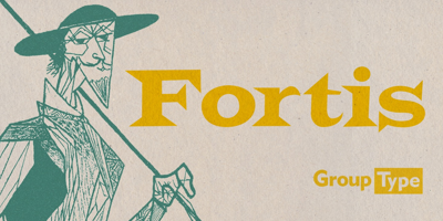
Serif Fonts
-
Example: Times New Roman, Georgia
-
Vibe: Classic, traditional, trustworthy
-
Best For: Editorials, books, formal websites
-
-
Sans Serif Fonts
-
Example: Arial, Helvetica, Open Sans
-
Vibe: Modern, clean, minimal
-
Best For: Websites, mobile apps, startups
-
-
Script Fonts
-
Example: Pacifico, Great Vibes
-
Vibe: Elegant, artistic, personal
-
Best For: Invitations, logos, social media
-
-
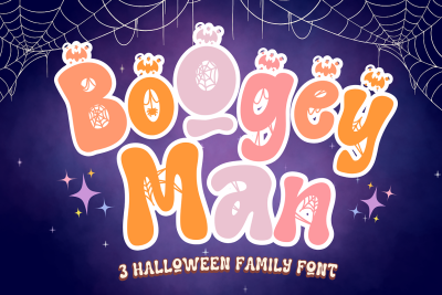
Display Fonts
-
Example: Bebas Neue, Lobster
-
Vibe: Bold, eye-catching, unique
-
Best For: Headlines, posters, branding
-
How to Choose the Right Font
Choosing a font isn’t just about what looks “cool.” Here are five key questions to ask:
-
What’s the purpose of your design?
Are you creating a resume or a party invite? Formal or fun? -
Who is your audience?
A tech-savvy millennial might respond better to clean sans serif fonts, while an older audience may prefer serif fonts. -
Where will it be used?
Screen or print? Web-safe fonts like Roboto and Open Sans work great for digital. -
Is it readable?
Don’t sacrifice clarity for style. If it’s hard to read, your message gets lost. -
Does it match your brand personality?
Your font should align with your tone—professional, playful, edgy, etc.
Common Font Mistakes Beginners Make
-
Using too many fonts in one project
-
Choosing decorative fonts for body text
-
Ignoring spacing (kerning and line height matter!)
-
Not checking mobile responsiveness
Where to Find Great Fonts (for Free!)
-
Google Fonts – free and easy to integrate
-
Font Squirrel – curated, commercial-use-safe fonts
-
DaFont – great for unique and creative styles (check licenses!)
- Free Font – Commercial Use Free Fonts
Final Thoughts
Typography might seem like a small detail, but it has a huge impact on how people perceive your work. With a basic understanding of font categories and some practical tips, you’re now ready to explore and experiment with confidence.
Start with just one or two fonts, test them out, and don’t be afraid to trust your eye. The more you play, the better you’ll get.


