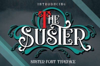
A Step-by-Step Guide for Beginners Starting in Font Design
A Step-by-Step Guide for Beginners Starting in Font Design
Typography is everywhere, shaping the way we read, interact, and experience design. If you’ve ever wondered how fonts are made—or dreamed of crafting your own—this guide will walk you through the essentials of starting your journey as a font designer.
1. Understand the Basics of Typography
Before you start sketching, familiarize yourself with key typography concepts:
-
Serif vs. Sans-Serif: Know the difference between fonts with decorative strokes (serif) and those without (sans-serif).
-
X-height, baseline, ascender, descender: Learn these basic letter anatomy terms.
-
Kerning, tracking, leading: Understand how spacing affects readability.
A solid foundation in these principles will help you design more functional and beautiful typefaces.
2. Choose Your Font Style & Purpose
Ask yourself:
-
Will your font be decorative, functional, or experimental?
-
Is it for print, web, logos, or something else?
-
Do you want a display typeface or a body text font?
Having clarity on your goal will guide design decisions like weight, contrast, and spacing.
3. Start Sketching Ideas
Grab a pencil and paper (or a tablet) and begin sketching letterforms. Focus on:
-
The key letters: n, o, h, a, d, e, s (these help establish style)
-
Consistency of stroke width and shape
-
Experimenting with different proportions
Don’t worry about perfection—this phase is about exploration.
4. Pick Font Design Software
Once you’ve sketched ideas, it’s time to digitize them. Popular tools include:
-
FontForge (free)
-
Glyphs Mini / Glyphs (Mac)
-
RoboFont (Mac)
-
FontLab (Windows/Mac)
Each tool has its strengths, but beginners often enjoy Glyphs Mini for its intuitive interface.
5. Digitize Your Letterforms
Import your sketches or draw directly in the software. Focus on building clean Bézier curves. Start with core letters, and apply their design rules to others for consistency.
Key tips:
Keep control points minimal
Test each letter in words, not just isolation
Use guides to align heights and spacing
6. Refine Spacing & Kerning
Spacing makes or breaks a font. Once your letterforms are in place:
-
Adjust sidebearings (the spacing on each side of a letter)
-
Test common pairs (like “To”, “AV”, “Wa”) for kerning issues
You can preview text in various sizes to catch spacing problems early.
7. Expand Character Set
A basic font includes A-Z, a-z, 0-9, and punctuation. If you’re feeling ambitious, consider adding:
-
Accented characters for multilingual support
-
Symbols or icons
-
Ligatures or alternate glyphs
8. Test & Iterate
Use your font in mockups: posters, websites, or app interfaces. Seeing it in context will reveal adjustments you might need.
Share with friends or designers for feedback
Print test pages to check spacing and weight in print
9. Export & Package Your Font
Once satisfied, export your font as OTF (OpenType) or TTF (TrueType). Create documentation and licensing info if you plan to share or sell it.
Free platforms like Google Fonts or marketplaces like Creative Market can help distribute your work.
10. Keep Learning & Experimenting
Font design is a craft that deepens over time. Explore:
-
Historical typefaces for inspiration
-
Typography books like “The Elements of Typographic Style”
-
Online communities (e.g., TypeDrawers, Typophile)
Final Thoughts
Font design blends creativity with precision. Your first typeface won’t be perfect—and that’s okay! The joy lies in experimenting, refining, and finding your own voice in letters.
Start small, stay curious, and enjoy the journey into the world of type.


